Frontend Build Automator Build Tool — Vanilla JS on Node
All Projects
When I find myself doing the same work for a while and I start to see commonalities in the day-to-day tasks, I think it's natural to want to automate them. Even if that's a little extra work up front, if you're expecting to repeat those tasks enough to justify it, it's both worthwhile and way more interesting than doing it by rote.
I may have taken that to an extreme in this case.
The Backstory
My frontend work at RD had had quite an influence on the department by that point. If anything new and interesting needed to get built, something custom or tricky that was dreamed up during the design phase or fashioned to fit a specific need, they turned to me. If there was an elusive rendering error or JavaScript bug that was stumping others, I was the last line of defense. Most of the reusable custom code that my department continued to rely on was mine.
Yes, I realize that comes across as me being a bit full of myself, but I promise I'm not! I say it to underscore that projects were increasingly reliant on my time and availability. It's a good place to be for job security, but not great for sanity, project milestones, or reduction of bus factor.
I feel like everyone has their own homebrew project boilerplate that they develop over the years. As the years of web projects went on I realized mine had grown rather large. Because it included a ton of features that I may or may not need for a given project, I was using it subtractively, cloning the boilerplate and deleting what the project at hand didn't need. I was constantly tweaking it and adding new things, meaning that if another frontend dev started a project by cloning one of my old ones — and that happened often — they might not be getting the latest and greatest. Git would have solved that problem, but some team members were averse to it.
This led me to an idea: I could make this boilerplate configurable and give the whole department access to it as an application.
Port 3000, My Old Friend
This wasn't any kind of big internal effort that got its own dedicated time, more like a little hobby project to see if I could. I mainly developed it in off hours or when a client delay gave me a gap in my day; as such, it was a slow process.

I decided to make it a web-based application because that's what I knew, building it in JavaScript on Node with Express acting as a server to a template-based web frontend sending down REST requests. I toyed around with various ways to actually accomplish what I wanted, which was a way to bake out a ready-to-go frontend build complete with a rich file structure, task runner pipeline, and all the needed customizations.
In the end I decided that the tool would ingest template files from a source directory on disk. Those files would be copied to a destination directory, preserving the existing file structure, and the tool would keep pointers to those files in disk. The source directory could include everything needed to set up a task runner in the final product and the tool would dutifully copy it over, so that's another basic requirement down, but I needed a way to inject customizations into the result.
[[Let's Add {Variables}]]

To that end, I developed a little custom templating language to use here. This would need to act as a layer that was processed before any other templating languages, such as those that would be used by the task runner in the resultant build, so it needed to not have any collisions with those. The idea was that as the server ingested those source files, it would also look for the appropriate templating syntax, break it into tokens, and retain a structure in memory alongside those file references in order to be able to process changes quickly.
What I ended up with was fairly simple, and probably limited in ways I'd discover if I needed to do anything truly advanced with it, but I was able to make it full-featured enough to accomplish what I needed. The primary requirement was, of course, to replace a variable with that variable's value as tracked by the builder application. Those variables would get their values from inputs in the UI, and those values would be baked into the result. Simple enough. But it would be more useful with more features, and so I built more features:

- Default values
- If a variable is
undefined, the template could use a fallback value instead. - Null checks
- The template can indicate code that should be omitted from the result if a variable is
nullorundefinedand there's no default. - Ternary operators
- The template defines two possible results, one of which is chosen based on whether the variable's value is truthy or falsy.
- Transformer functions
- If we want derived values based on a variable, the template can use one or more of the transformer functions registered with the application to change the output; for example, if a variable holds a hex color that we want to display as RGB somewhere, the template can apply the appropriate transform.
- Comments
- Blocks or lines may be marked as never included in the output.
- Escaping
- Templates can mark characters as explicitly not belonging to this templating syntax.
So What Does it Do?
With a templating engine working and with enough features to accomplish things, it was time to accomplish those things! The builder tool would need an interface, that interface would need to expose configuration options, and those configuration options would need to make their corresponding changes in the output build.
Despite my affinity for spending time designing things, I didn't do much of that here, eager as I was to start building. The UI turned out pretty simple as a result: a vertically scrolling page of various options and controls with a live preview pinned to the screen. The preview can be expanded and collapsed, and its size can be changed to preview different common responsive breakpoints.
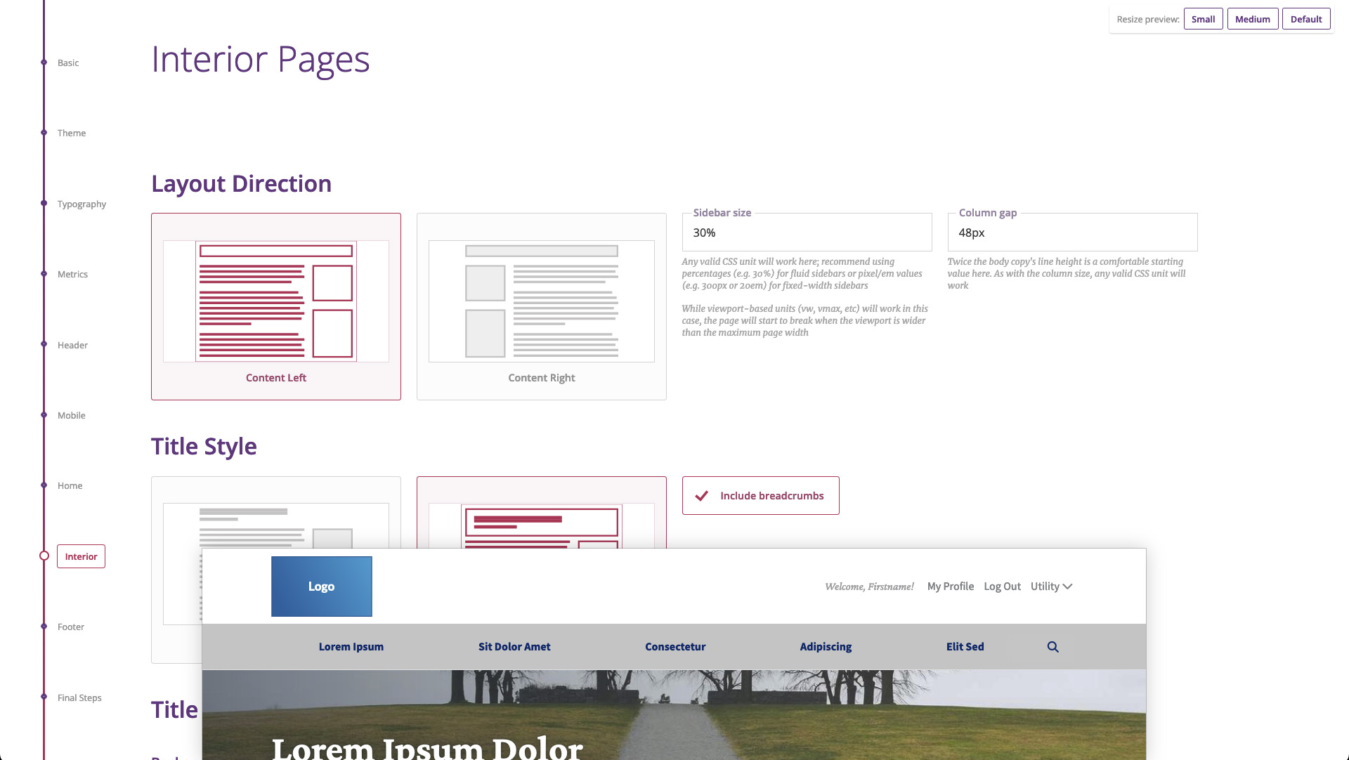
I hunkered down and started building, powering through enough configuration options to be useful, such as differing options for header layouts, the ability to define and use color palettes, global typography adjustments, and so on. I used it on a couple of my own projects to test out its viability, and already it was extremely helpful in producing customized boilerplate — but I wanted it to go further. With options for enough of our "usuals", it should be possible to cover the first half to two-thirds of the static build process.
I brought it forward to the department managers, and seeing the potential, they allotted me dedicated time to continue work. After more crunching, I had a solid base and opened it up to the other frontend resources.
Builds immediately became faster and of higher quality. Other resources no longer felt the need to scavenge existing parts from previous projects because the latest version was right there in the builder, ready to be customized with a few simple controls to fit the project's custom design effort. Despite that I'm now a full-time iOS developer within the same company, the builder is still a standard part of every frontend project's pipeline, and I still add or tweak features as needed.
Today it offers many things, but here are some select examples of its functionality:
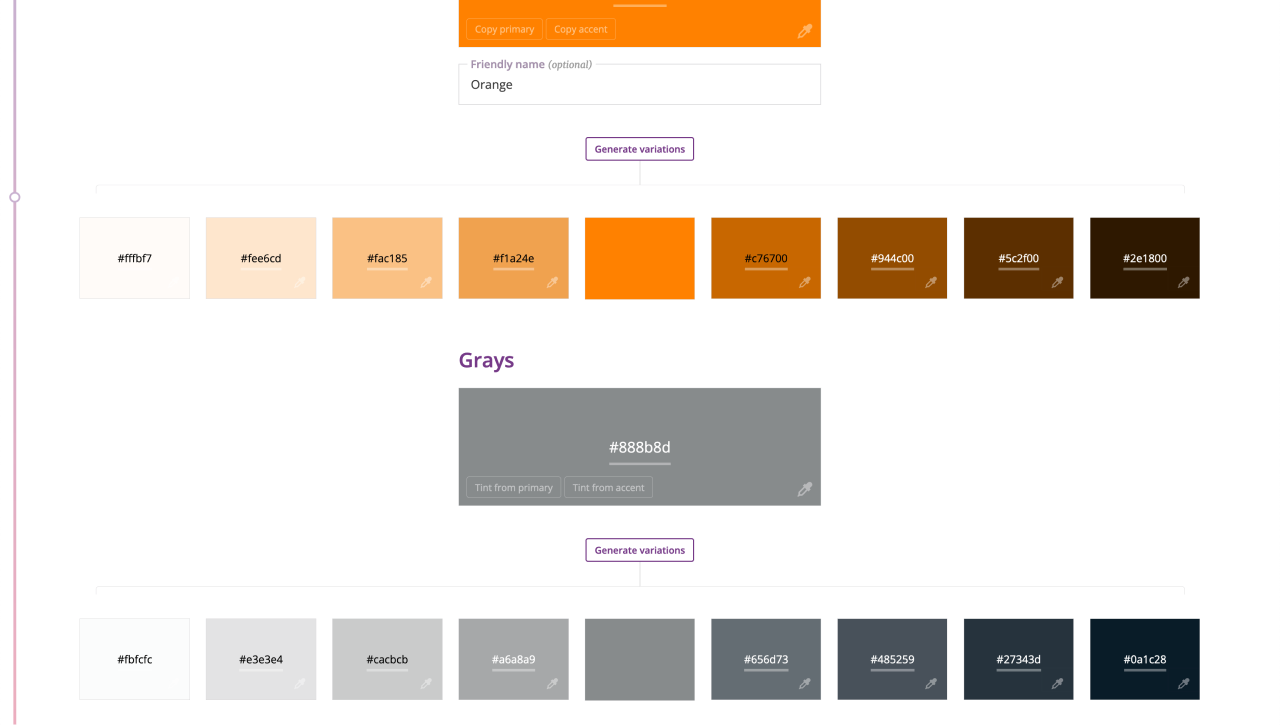
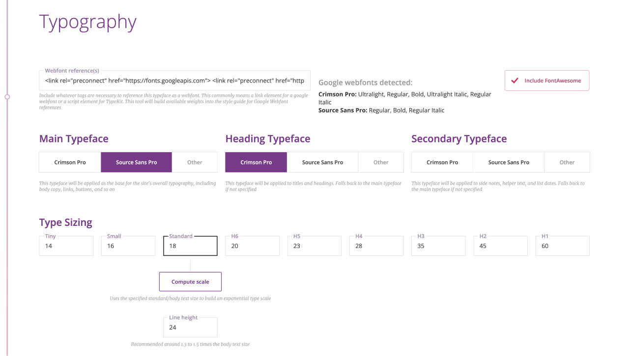
If the build is using external webfonts, their resource links may be copied and pasted into the input, and if one of those resources is from Google Fonts, the application will auto-detect the typefaces and styles being used and make them available as configuration options.
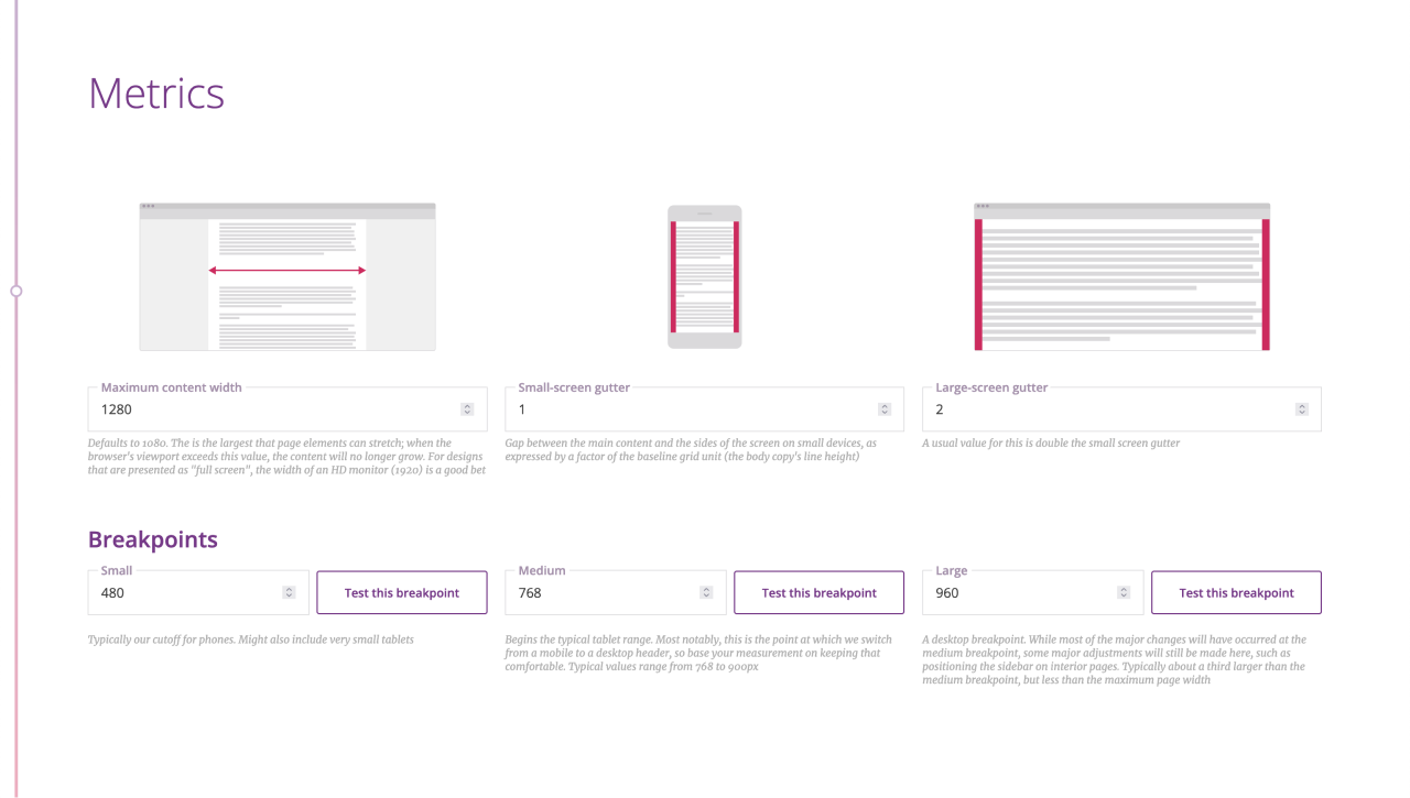
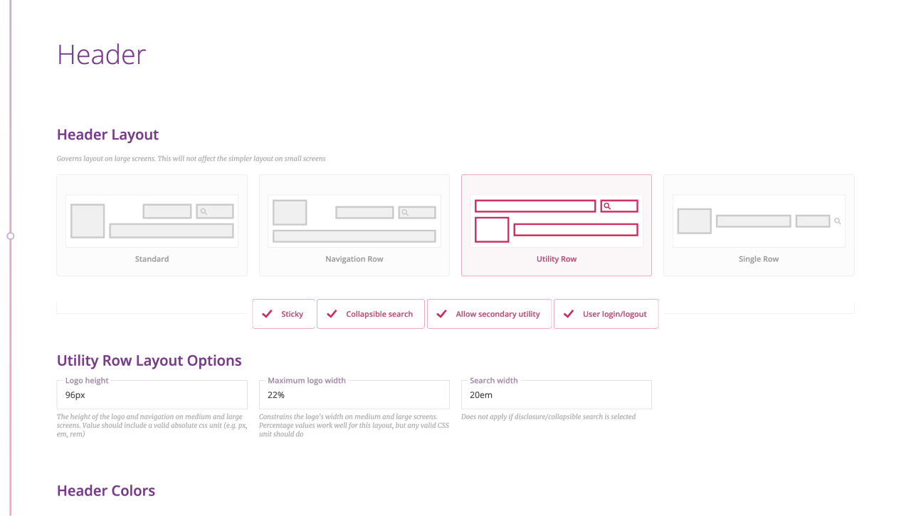
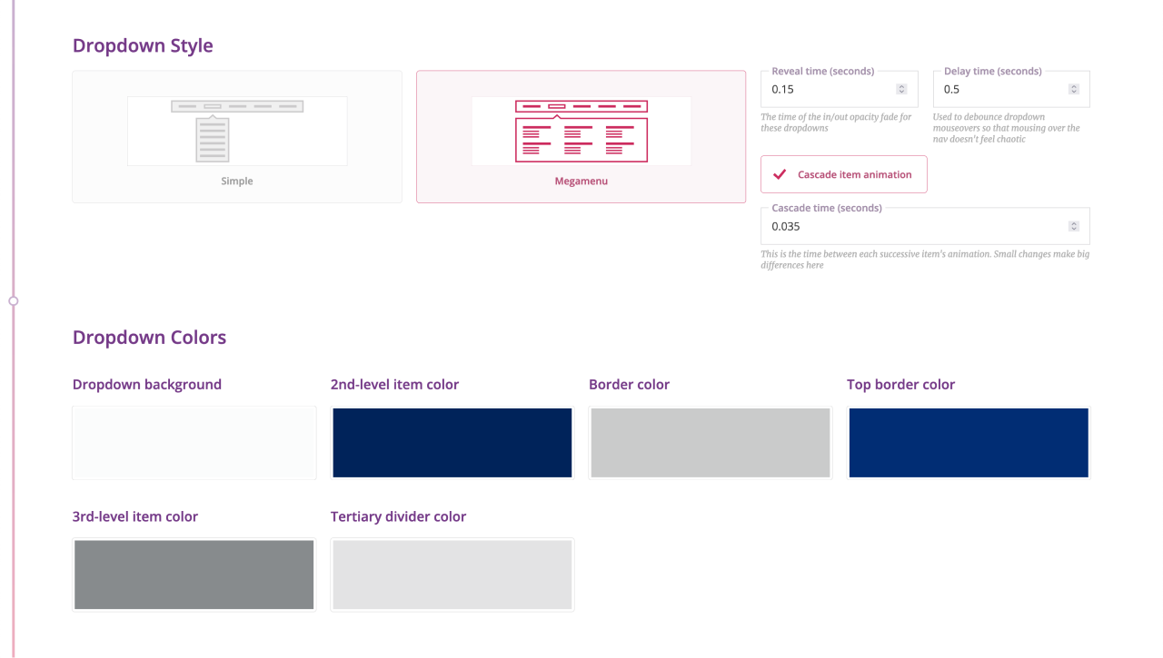
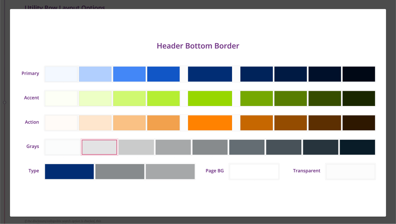
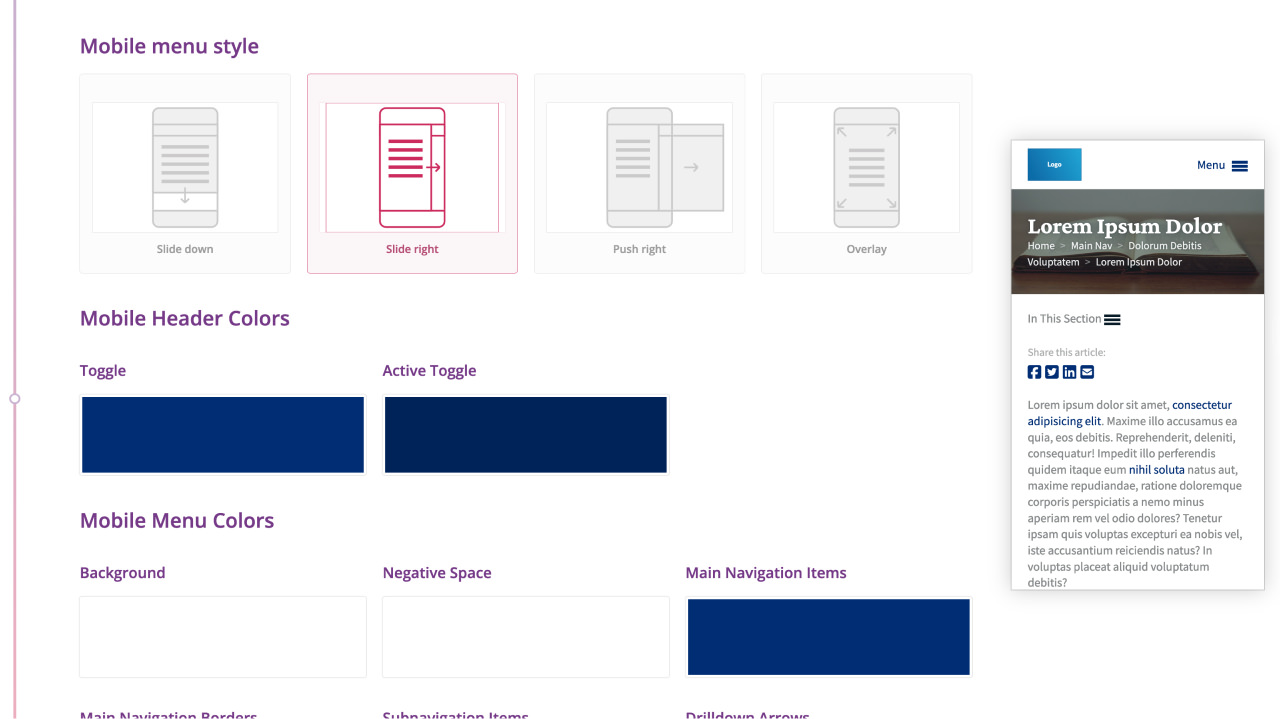
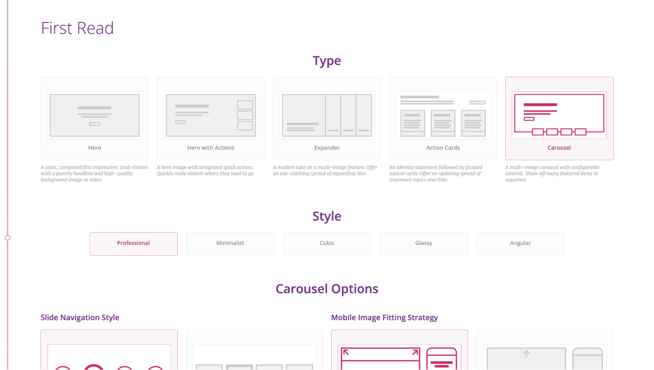
I added to this set of choices over time based on design trends and what tended to be most useful to our clients as time went on; the Expander option was added as a result of the success of AIAA's design, for example.
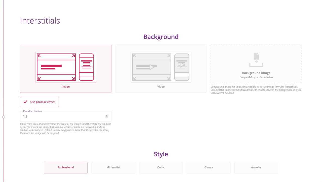
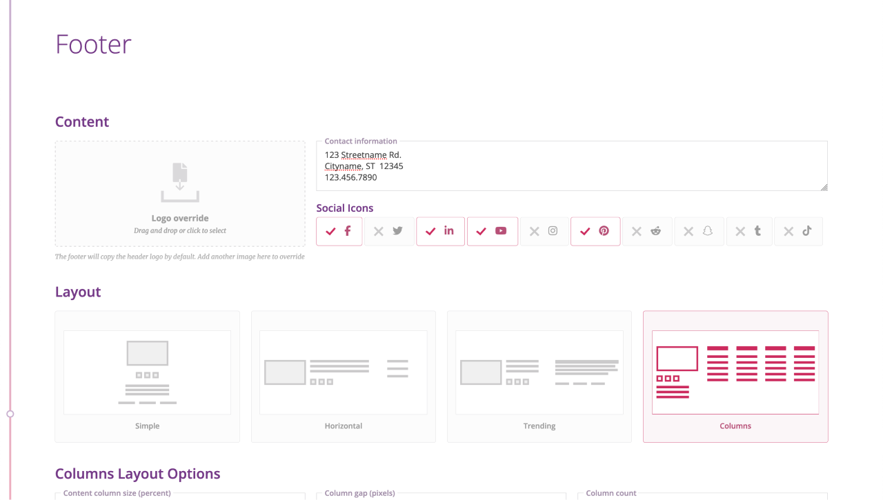
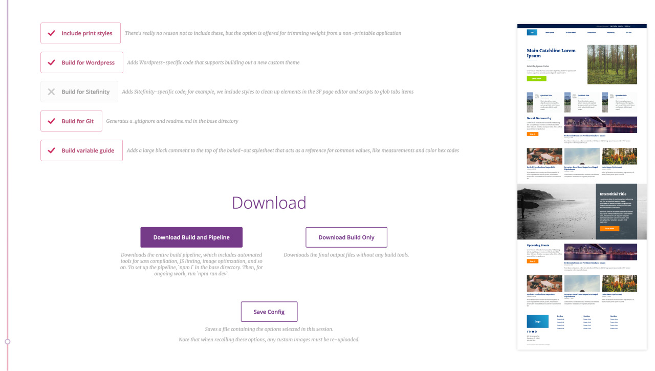
Once done, the user can choose to download their build as an archive, with an option of whether they want the entire task runner pipeline or just the output build. The options they chose may also be saved as a json file, which can be loaded at a later date in case they'd like to generate the same build or make quick tweaks before redownloading.
There are many, many more features to this build automator, but I'd call the above parts the more interesting ones. I'm pretty proud of this thing: it increased the efficiency, output quality, and general happiness of the frontend team significantly; frontend efforts were able to have their time commitments cut by half or more; and, to be honest, it was just fun to build.