American Institute of Aeronautics & Astronautics Website Design and Implementation — Photoshop, Sass, JS, Progress Sitefinity
All ProjectsAIAA is a prominent member-based organization whose purpose is to support engineers, researchers, academics, and govermnental representatives as they chart new frontiers in aerospace. In their words, their members have "achieved virtually every milestone in modern American flight." In terms of a website redesign, rebuild, and rebrand, to us this meant quite the large effort.
This project is an older one (I was still using Photoshop for design! Egads!) but I believe it to be a good representation of my work with RD's frontend team in regards to translating client wants and needs into a large, functional web property. It included a full website redesign, a rebuild in a new CMS, a new content strategy, and the organization moving on from their aging branding, in part spurred by the direction of the website design. Within our company, it was handled by a team of three.
Design
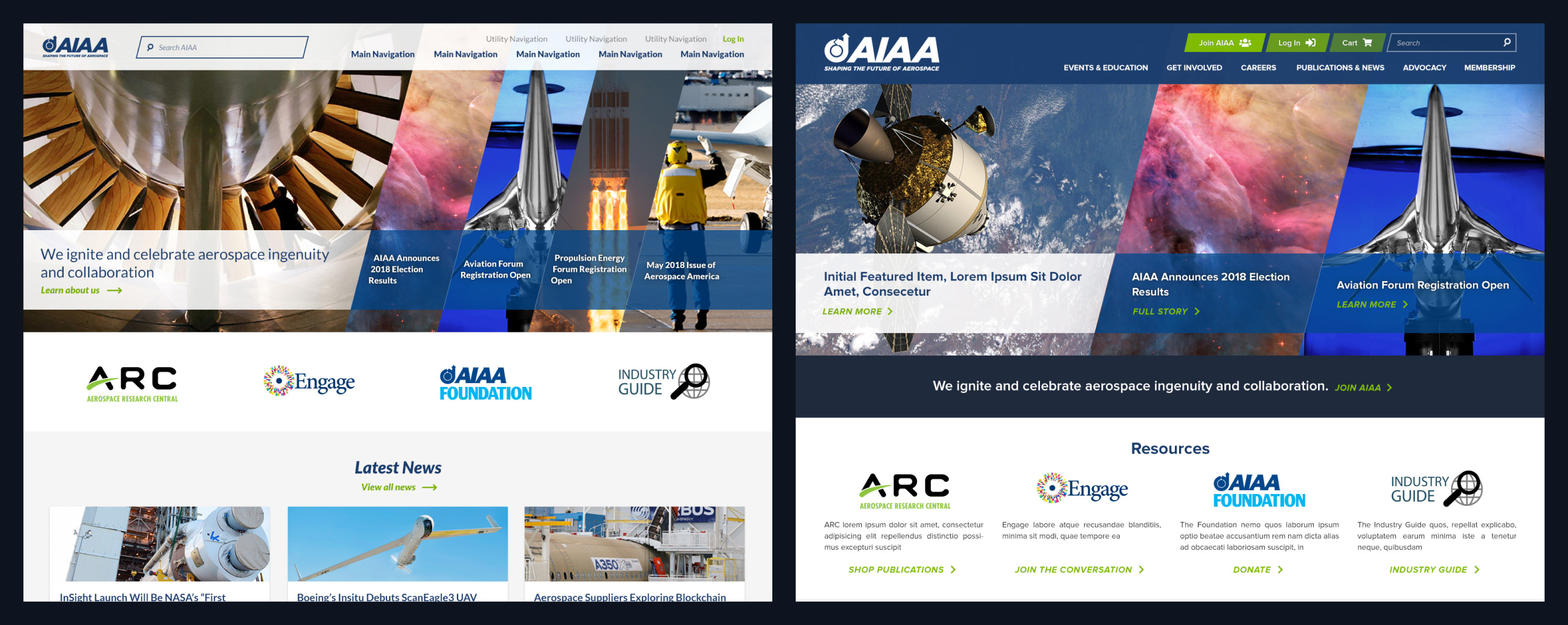
This project represented AIAA's push towards updating their organization's image and brand strategy. They expressed a desire to push their branding forward and be a little different, moving on from the stodgy boxes and plain type of their existing web properties. In my initial design, this manifested as striking angled lines, confident typography, and a proposal for a new type of feature component that met their requirements for a striking first homepage read that could also display a dense amount of information.

The company's usual design process consists of three of the company's designers interpreting the client's needs and wants independently, each creating their own homepage comp with its own features and visual direction. We each present our proposal in a reveal meeting with the client, and then the client decides on elements of each they like and dislike. From there, the lead designer on the project synthesizes all of this into a unified design proposal. This project was pleasant because I was the design lead and the client enthusiastically embraced my direction, leading to great rapport and fast turnaround of subsequent rounds.
Implementation
This effort was parallel to that of my frontend build automator, so I didn't yet have that tool to help the static build along. Luckily, this effort informed many new use cases that I proceeded to build into that effort, and those options saw a lot of use for future clients. I particularly enjoyed implementing the homepage feature, which has seen a lot of use on other sites since.
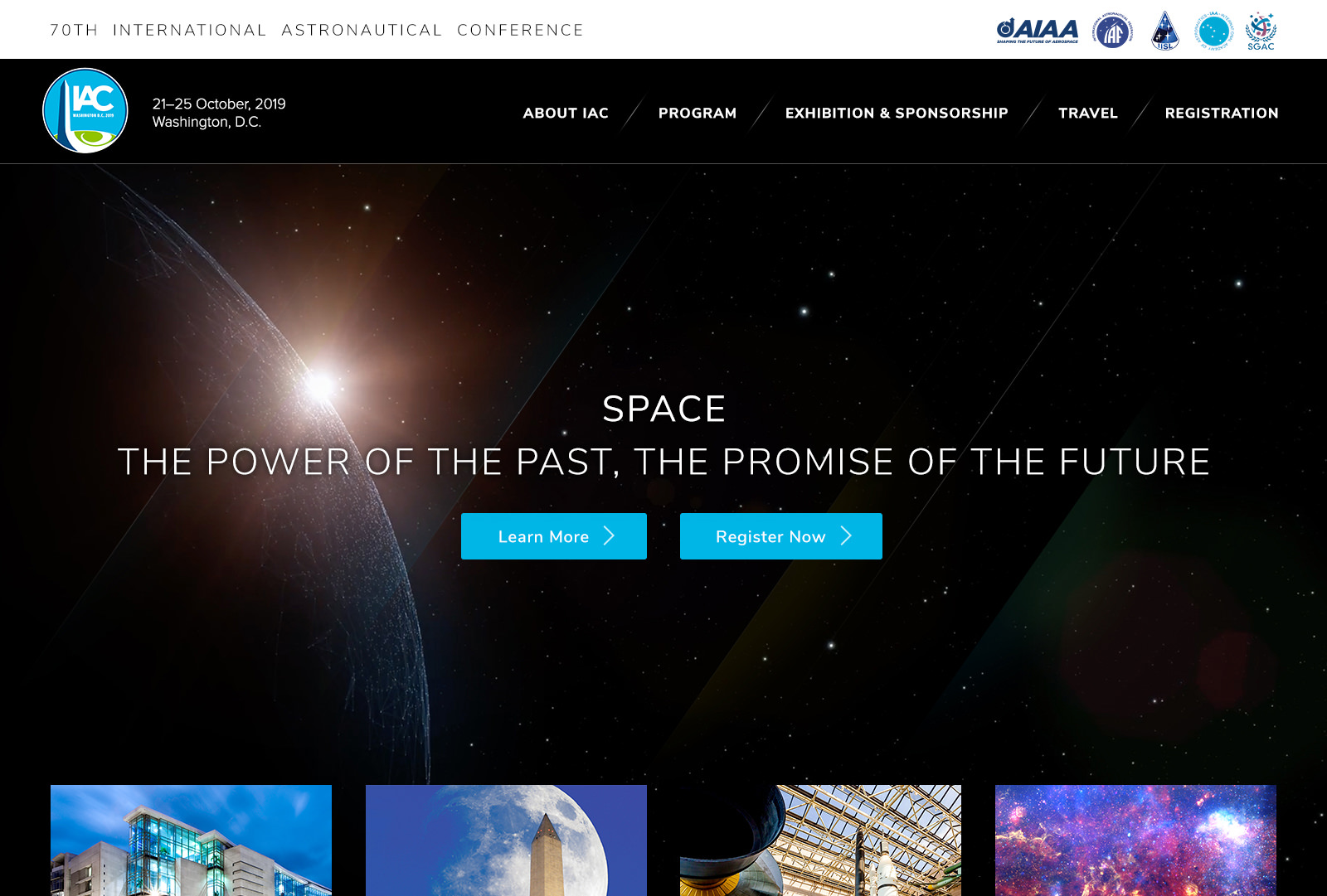
Another requirement for this project was an array of full-site templates that the client could use to quickly spin up new, single-use sub-sites for their events. We provided them with a selection of these, each ready to spin up quickly, and they were able to apply limited customization to each in order to visually distinguish them between different years or conferences. These also warranted their own design process, which was a fun exercise, especially because at that point me and the client stakeholders got along well and I enjoyed working with them more.

My usual practice is to place a large emphasis on the client's editing and management experience, making sure pages are easy to build and content is easy to author, including many customizations of Sitefinity's page builder and in-CMS documentation of content types and fields. Here, that manifested as our usual suite of custom builder components and a heap of documentation and trainings, as well as spending extra time with the unique features of the site (such as the homepage feature or the sub-sites) to ensure they were pleasant and straightforward to use.
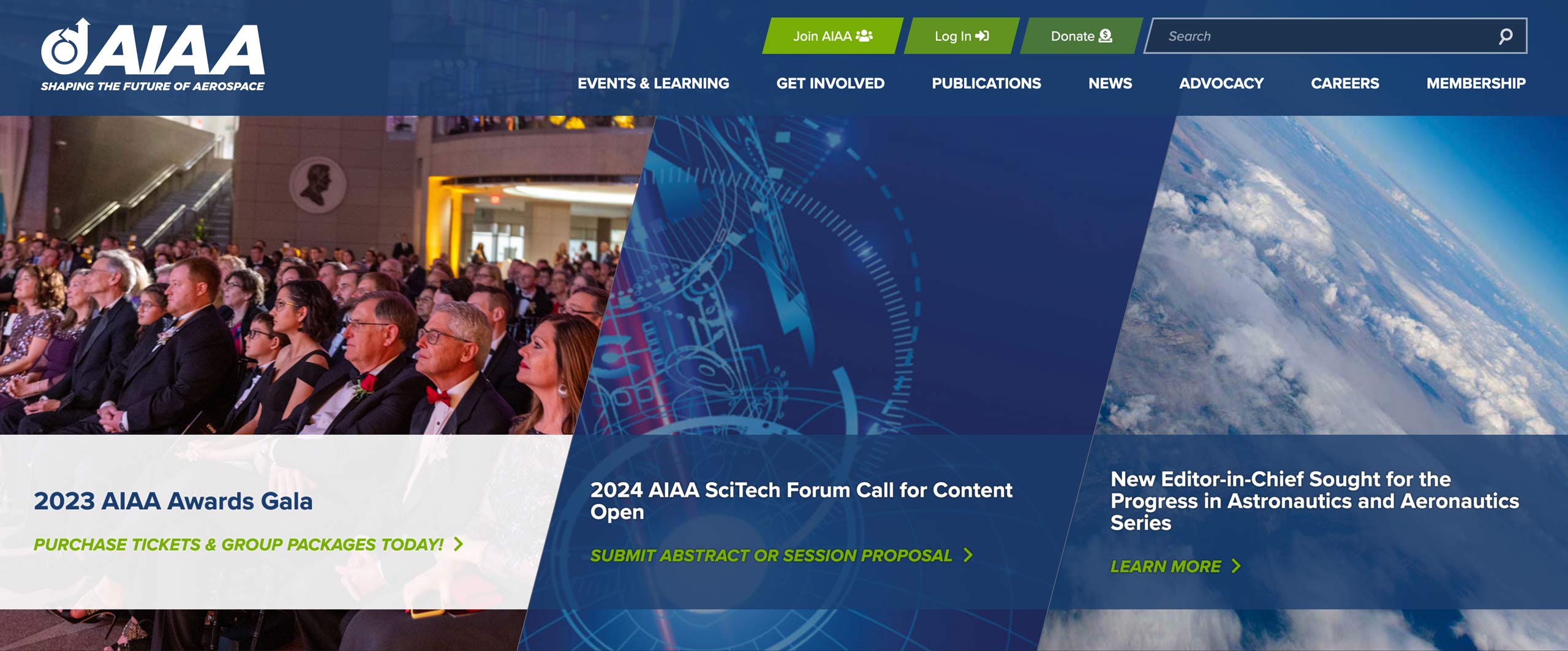
A few training sessions between me and client stakeholders capped off this effort, leaving all parties pleased with the work and ready to bring the new site live. They were a great association to work with, and I appreciated their desire to push their visual identity forward. And after the site had been live for a few months, they praised the increased user satisfaction, reduced load times, and decreased number of clicks required to get users to relevant content.
