Conversations Native iOS App Design and Implementation — Figma, Swift, UIKit
All Projects
I joined RD's mobile department and started my journey learning iOS development in 2023. By this point I've learned a good amount of new things (see: the CS degree I finished up that same year), and I have a good idea of how I learn best: first, I like to give myself a general overview of the topic (usually by reading a book), then I sink my teeth into a project or two, something non-trivial, of larger scope and complexity than the usual toy apps. More "real" efforts exercise not only the individual atomic skills within the topic, but also how they're combined and organized in the context of a real-world project.
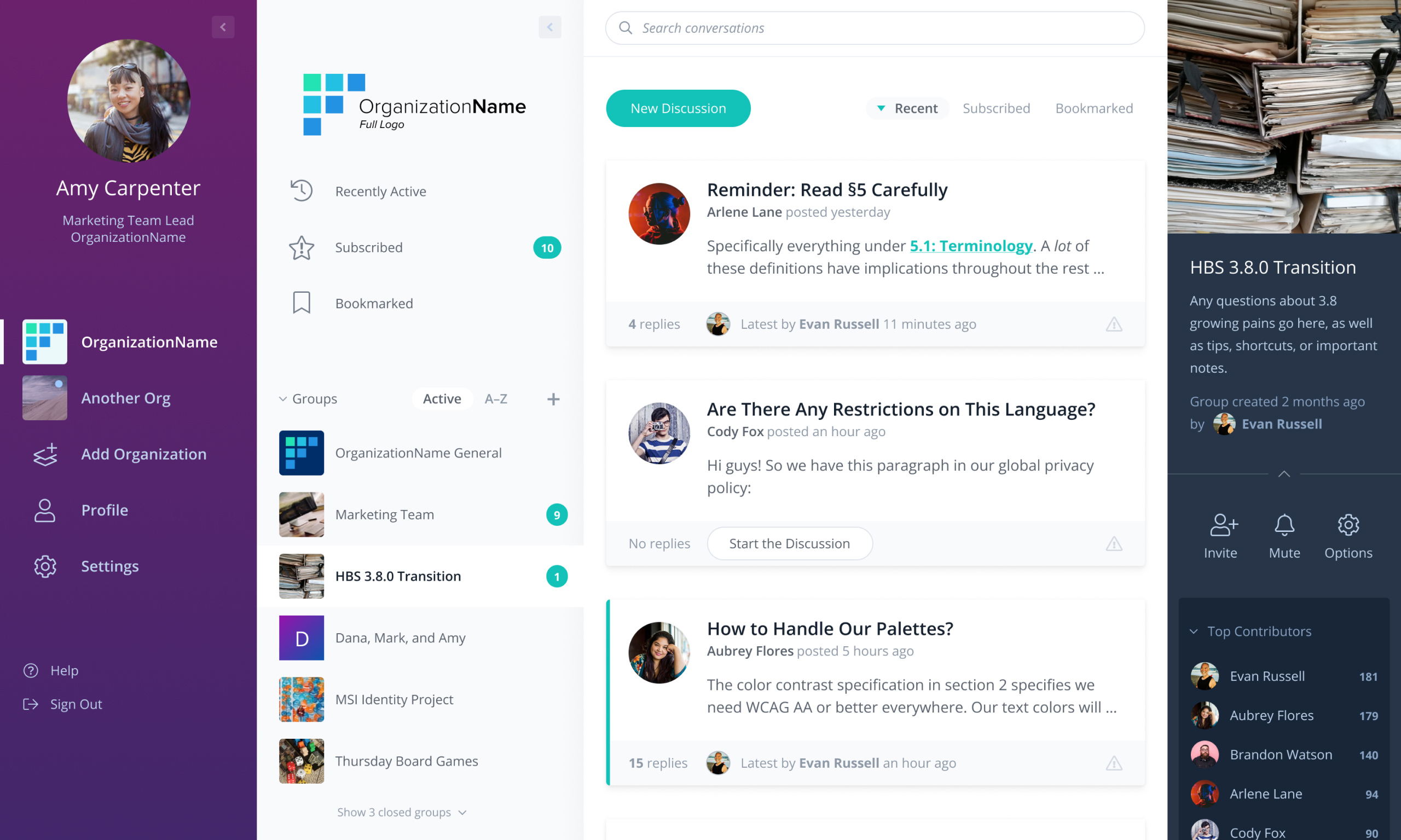
RD Mobile's main product has many features that are only available in the web interface. When I was brought over to the mobile team, leadership expressed a desire to achieve parity on the native app sides, especially for larger features. Since I was enthusiastic and it was on the list, we decided to see what it might look like if our Conversations feature was its own app.
Design
Conversations was of our more complex additions to the product over the years. At its core it's a forum product that's integrated with the rest of our features. Since our clients are, by and large, member-driven organizations with specialized focii, it's valuable for them to have a space for members to have discussions related to their disciplines, concentrating knowledge and experts ready to chip in with their experience in one convenient place.

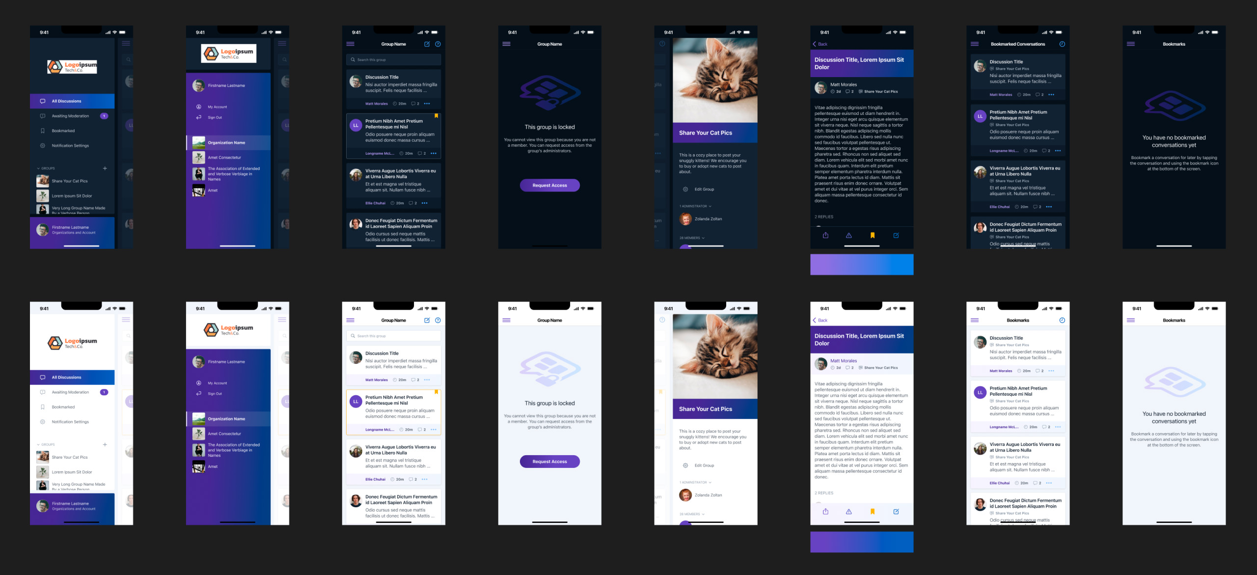
Having learned a lot about native app idioms and limitations while designing The USA Cheeseboard, I went head-down on this for a few days and produced an initial medium-resolution prototype. It was well-received, and I continued designing while working with the higher-ups to ensure it was meeting the need.

Implementation
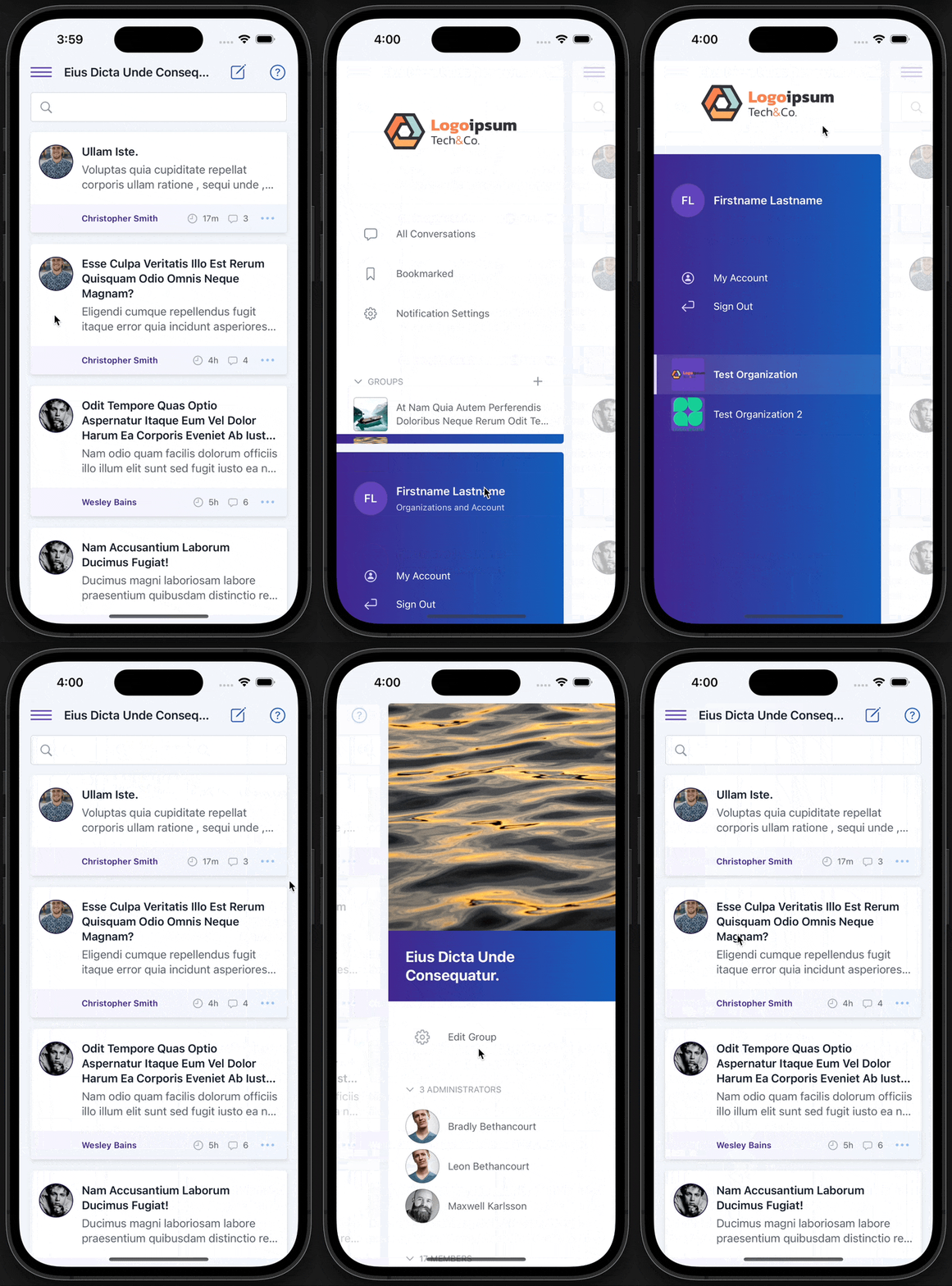
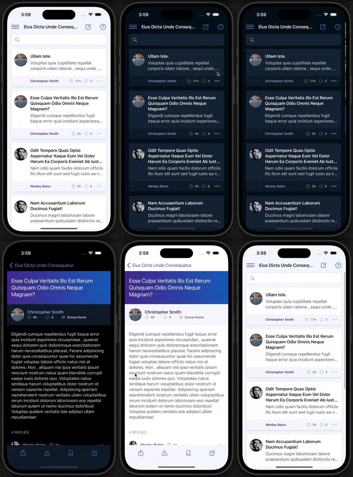
Aside from being a great learning experience in how to organize and coordinate larger projects, it was quite interesting learning how platforms that aren't browsers handle animations and interactions. And despite variations between devices and versions of iOS, being able to target a single platform felt pretty luxurious, especially with such deep IDE support.

I landed on this panel-based design when I was considering how best to adapt the web UI. Actions and information were already logically grouped into panels there, so it made sense to keep that organization. Depending on the user's needs, changing groups and inspecting the current group both seemed like items of primary immediacy and should both be able to be accessed quickly. Changing organization entirely or managing one's account should be far less common, and therefore I thought it acceptable to add another gesture in the way of getting there. In all cases, the most immediate actions should be within thumb reach — this is why panels have such generous spacing and decorations near their tops.
This project is built with the main stack and features that our company's primary product uses — Swift, UIKit, Core Data, RestKit — in order for me to get my practice in a more relevant environment, though I feel this would have been a great project on which to learn SwiftUI. If this effort falls by the wayside and comes back, that's something I might be tempted to explore.
In particular, I'm not sure I'm a fan of the storyboarding system that was the cornerstone of iOS development for so long. Despite starting this effort using storyboards, after not too long I found myself foregoing them and creating views in code instead.

As this is currently a lower-priority item than other efforts, it's still in development; I put in a little work on it here and there when there's a gap in my schedule (which isn't all that often these days). So, while I'd love to provide an App Store link, it's not quite there yet!
In the meantime, my primary efforts are on the design and development of new features inside the core product, working on this when I can. I look forward to typing up case studies for the major overhauls and new features that are in progress there.