Engagefully 365 Overhaul Native iOS App Redesign and Implementation — Figma, Swift, Objective-C, UIKit
All Projects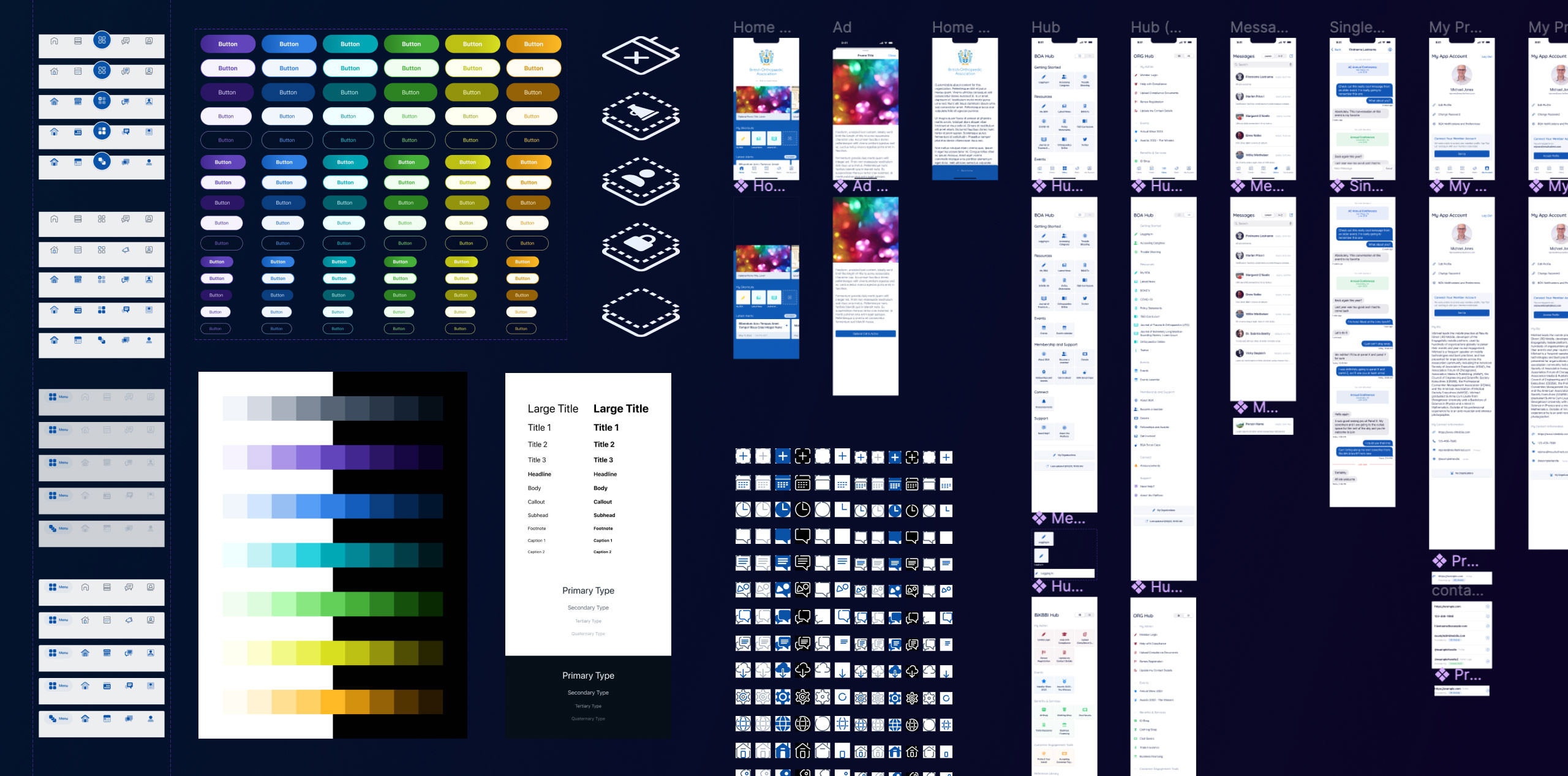
RD Mobile's main product, Engagefully, is a very large app that does a great many things.
Part of it is an events tool, employed at trade shows and annual meetings and the like to manage schedules, exchange virtual business cards, message other attendees, and so on; this bit is sold as Engagefully Events. The other half of the app, branded Engagefully 365, aims to be less ephemeral, providing a platform for content and features relevant year-round.
My first major project after moving to the mobile division was a full visual and architectural reimagining of the year-round section to make it more usable, relevant, and visually attractive, followed by a fresh implementation to match. It was my introduction to the codebase and to several sub-disciplines of app development in general, such as networking and caching, advanced architectural patterns, and App Store policy compliance. Learning to swim in the deep end is often effective for me, so let's dive in!
Challenges and Objectives
This product has a multitude of features that were added over the course of over a decade, and the codebase I inherited was largely undocumented. The whole project seemed to have been architected thoroughly and thoughtfully, but since I was brought in without an opportunity to train under the old iOS lead, ingesting the complex and opinionated structure was a time-consuming prospect. With no written material to go on, I would simply have to infer via exploration.
Organization would be another challenge. The year-round section was, in essence, a single client-defined menu containing one to many items (one extreme real-world case has fifty); those items could be simple links to web pages or WYSIWYG-authored content, or they could be entry points to one of the app's myriad features, such as messaging or announcements or a crossover to Engagefully Events. Most features were added over time in response to client needs, and before now there had never been a design reckoning that took a big-picture look at what's important, what could be more usable, what features are the most consistently used, and so on.
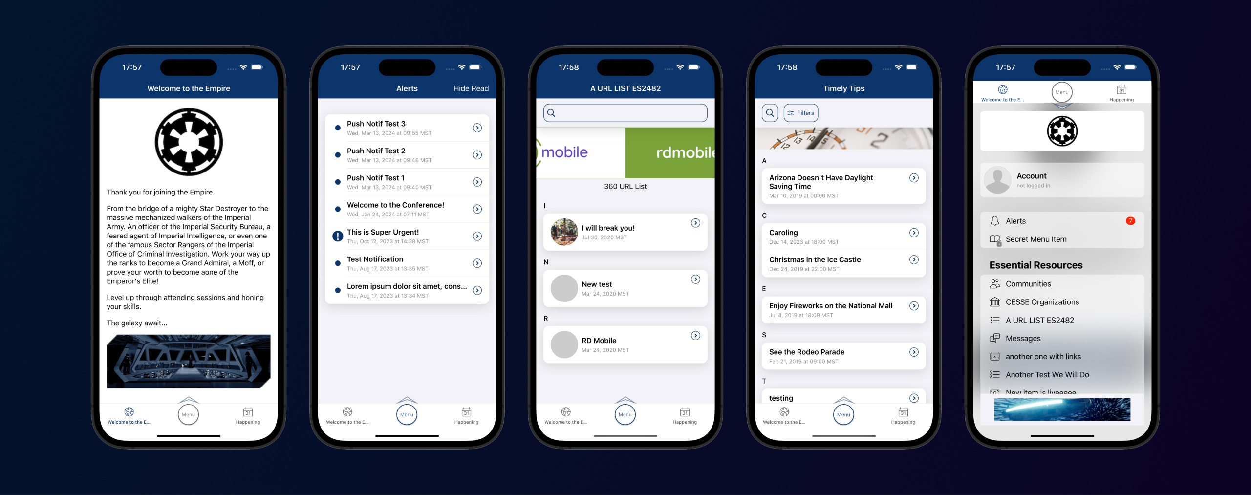
Redesigns also come with their own perils and traps; for example, while a shiny new UI may be more visually attractive and pleasing to use, if someone is used to the old thing, knows deeply how to use it and has all that muscle memory built up, who is the designer to dictate which version is "better" for that person? Fair or not, any redesign that isn't immediately usable to the level at which they were previously operating is a failure to existing users.
Distilled, there were a few must-have objectives here. "Make it prettier" was a given, but it should also be familiar to existing users at the same time. There should be dedicated UI for common features, but the core flexibility should be left intact. And all of this should be accomplished with little to no work required for each of our clients — if a given client wanted to make zero changes to prepare for the transition, the interface should still look polished and intentional.
Time to get to work.
Design
The app I inherited was extremely flexible … to the point where it was actually a detriment to many clients.

The customizeable menu acted as a core, and as mentioned above, the app would take the first two items out of the menu and pin them in the bottom tab bar. That first tab bar item would become the "welcome" item, the default screen that users would see when launching the app. While it made sure that any client could enforce any feature as their primary use case, it also put the burden entirely on them to create a welcoming and useful first-launch experience.
We audited our clients' content and found that most of them used a webpage in this spot. Around 70% used it for introductory content: a logo, a little about the organization, a splash of feature explainer. Primary and secondary functions were saved for that other tab or were stuffed inside the menu, and those functions were as varied as our clients are.
Already, that was two things I was able to latch onto to start designing:
- I wanted a home base, somewhere for users to land. The organization should be able to brand, customize, and add expository content to it, but it should also be useful both on the first launch and the hundredth.
- We would keep the menu, of course; I would give it a visual overhaul, but it should be able to use only the existing information provided by the API. I also wanted to keep users' muscle memory of accessing the menu in the middle of a bottom tab bar intact.
Tabs Are Safe but Good
Keeping the tab bar seemed like a good path forward. And a more concrete tab bar, one with a defined set and ordering of possible tabs, would help keep things more consistent, require less work from the client, and allow us to promote common features useful to most clients' users, such as having an account or quickly accessing events.

We quickly filled out a five-item tab bar by noticing that most of our clients utilized the events and year-round notifications features (around 90% and 60%, respectively). If a client didn't use one or both of these, they should be able to disable the relevant tab(s), which would remove it from the interface. This was immediately problematic for my emphasized center Menu item: if a client disabled one of those tabs, Menu would suddenly be off center, knocking the emphasized item to the side, making the only visual constant in the UI look lopsided and uncomfortable. In lieu of conditional visuals, we settled on a more minimalist look.
Icons Aid Identity
In parallel, I was developing icons in various styles that would complement and reinforce the new visual treatment. The app I inherited used two icon sets, one for menu items and one for UI; the menu set was pulled from a long-defunct collection whose name nobody could remember, and the UI set was hand-drawn. Both were baked out as sprites from Sketch files that nobody could find (another case for thorough documentation!). Since both were visually dated anyway, the time of change was nigh.
Given the rapidly-evolving nature of the feature set that feeds into the menu, I thought it best to plan for the inevitable case in which we needed new menu icons with a fast turnaround; to that end, I settled on using Font Awesome Duotone for menu items. It would remove the need to go through myself or another designer for a new icon, and the library is extensive and impressive. The duotone style feels solid; it's professional and slightly aloof but still friendly. Given certain plans I had for the menu, it was also a bonus that these icons could generate visual interest given a single tint color.
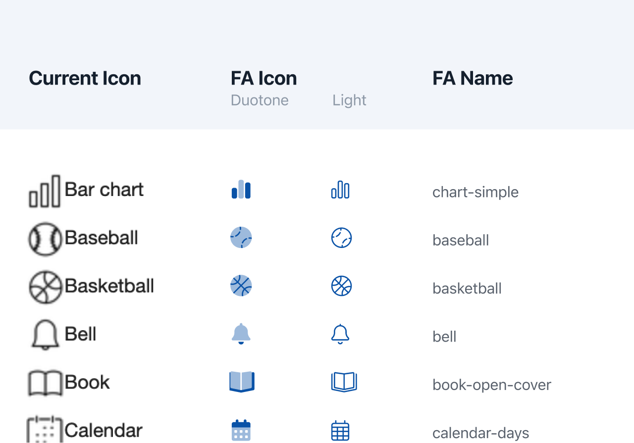
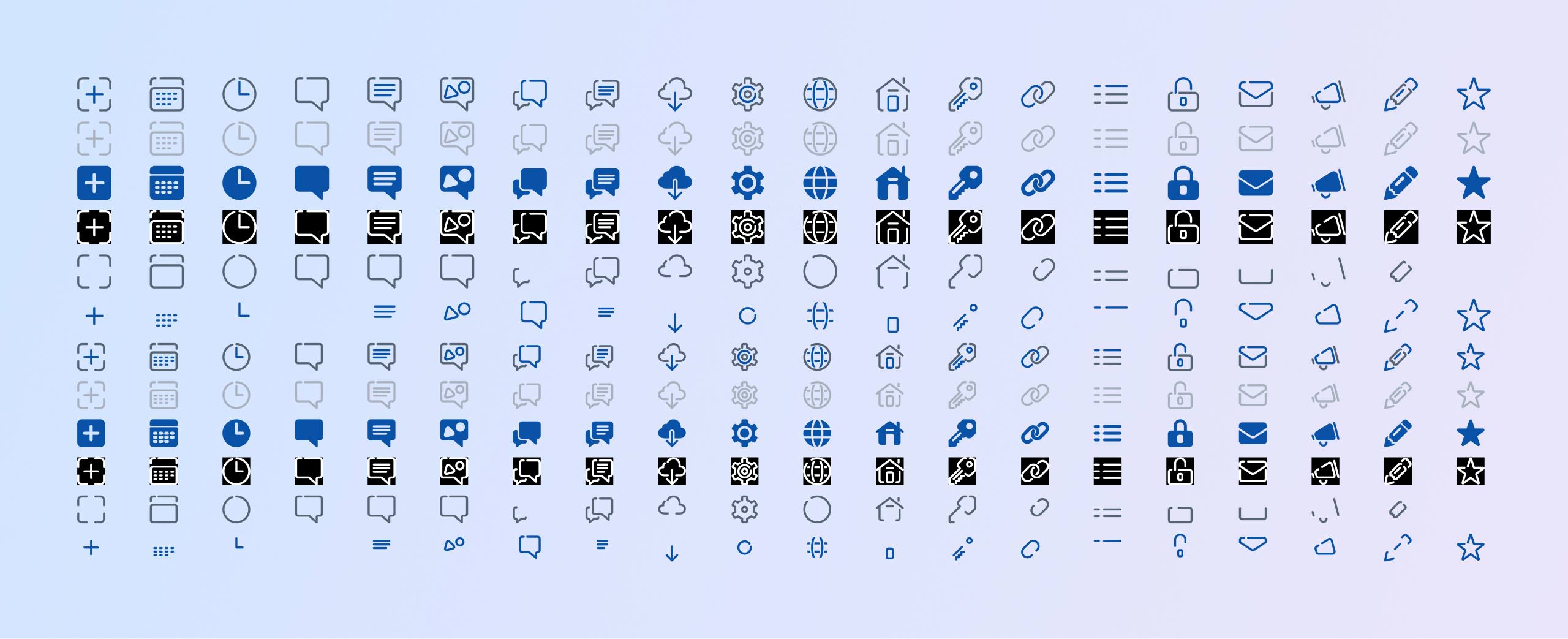
The UI, though, could afford something a little more unique due to limited nature of the set. I trialed several visual styles, drawing icons using Figma's vector editing tools, which, while not all that advanced, were pleasant to work with. I appreciated that they're useful for seeing what the final pixel output would resolve to in various sizes, as we support some platforms that can't use vector icons without significant effort. Drawing these icons such that straight edges lined up with the pixel grid at all standard sizes (1x, 2x, and 3x) did wonders for the readability and crispness of the final assets.

In the end, there was wide consensus that the style I had dubbed Broken Line was the right look and feel, balancing modernity, friendlines, professionalism, and visual interest, all while remaining a good match with the general RD brand sensibilities. I got to work drawing out all the icons we'd need for the UI, adding to the set as I continued mocking up screens. Each icon needed four styles — standard, disabled, selected, inverse — and two base sizes, one that felt correct for the general UI as well as a slightly larger version for the tab bar. Luckily, getting into the zone and drawing these with some long-form YouTube videos in the background was my idea of a good time.
The Home Screen
A home base would need to accomplish several things:
- Provide a welcoming and attractive introduction for new users without imposing so much of a visual identity so as to overpower client branding.
- Provide a springboard to commonly used features, staying useful for returning users.
- Include enough client branding opportunities to feel bespoke.
- Allow the 70% of clients that configured their first screen with expository content to continue to provide said content.
- Be configurable by clients via disabling of features or rearranging of items.
- Allow for new features and content to be added in the future.
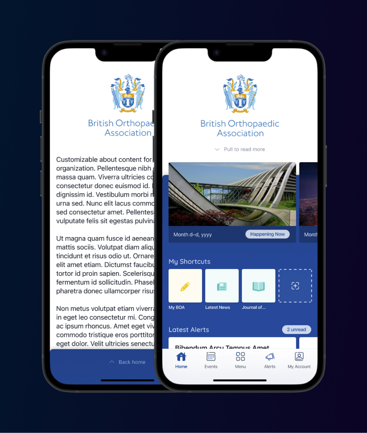
Similar to The USA Cheeseboard, I landed on using the collection-based nature of the iOS App Store as a base. Different features could be sections in the collection, and their constituent atomic items, such as individual events or single announcements, could be elements in the section. This could also be reorderable and items could be disabled without impact to the layout, and it provides infinite canvas to append new items onto in the future.
In keeping with the principle of progressive enhancement, the default experience with no client configuration should be both attractive and relevant, with optional features that a client can use to make it better. For example, I branded the home screen with the logo that we previously used in the menu, choosing a bounding box that would look good with existing assets, while optionally allowing the upload of a new asset specifically for this screen if they so chose. The client's chosen branding color also came into play in the background, reinforcing their identity just that much more.
"About us" content tends to carry disproportionate importance to clients, but it tends not to be relevant past the first read. While many customers made that their chosen landing point in the past, I felt as though it was something that could be hidden behind a tap or gesture if the prompt or trigger was obvious enough. It should be both prominent and hidden, easy to spot but also easy for the eye to pass over. In the end I settled with hiding it behind a single swipe gesture (or, optionally, a tap on the logo) with a minimal hint positioned in the high-importance branding area.
Lastly, I came up with a local shortcuts feature to accomplish two main objectives: for one, I wanted to provide useful additional functionality with this redesign; for two, I wanted to allay some transitionary friction for both users and clients. Shortcuts are simply menu items pinned to the home screen, allowing fast access of commonly-used functions, configurable by the user. It's conceptually quite a simple feature, but it reduces many frustrations with the slowness of combing through a potentially very large menu over and over again to get to one's most-used items.
On the second objective, I wanted to prepopulate the shortcuts section with the first two menu items upon first run of the new UI. This would both demonstrate the use and management of the feature as well as take the place of the two items that would have previously been moved to the tab bar, thereby mollifying both users that are used to seeing those items prominently on first read and clients that had previously marked those as their two most important items to see. And since they're strictly local, device-only preferences, there's no additional server configuration required.
The Menu
As the second hinge around which the entire app would revolve, getting the menu right was extremely important. It's the area that existing users would be familiar with and expect to work the same way, being that it was the core of the previous iteration. At the same time, it should feel fresh, smooth, and attractive.
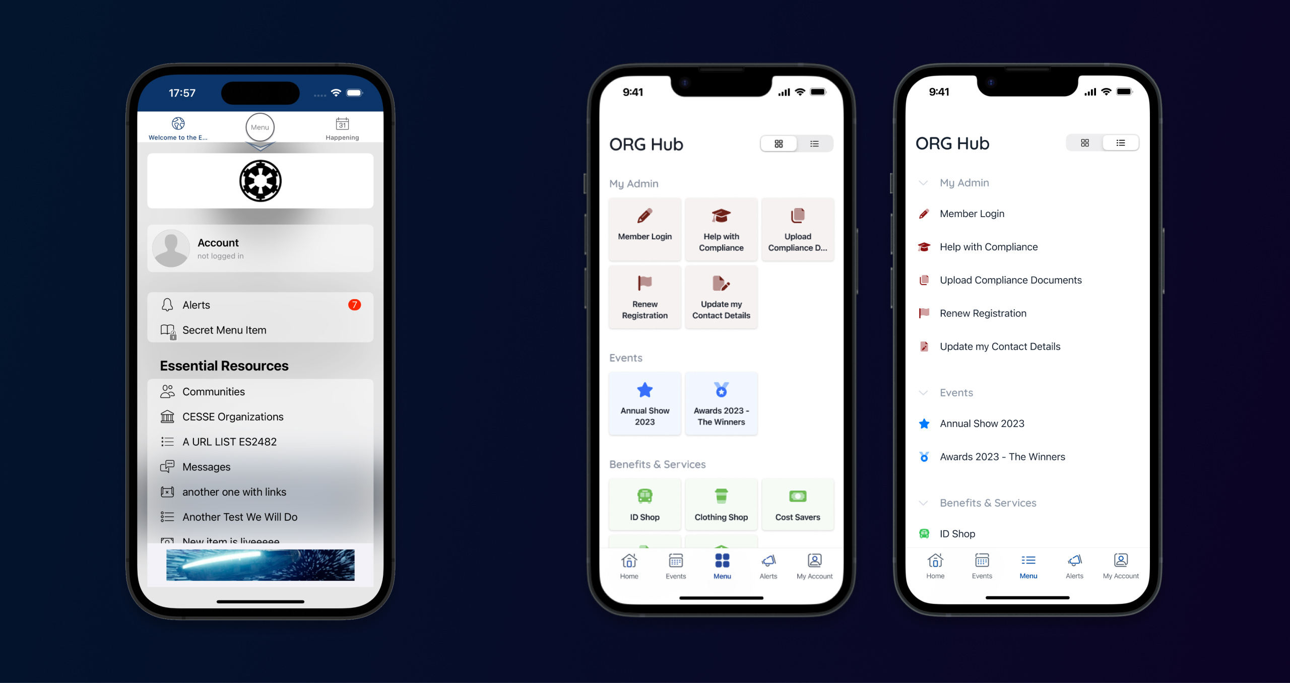
In meetings with the CEO, he mentioned he had an affinity for the way the Facebook app handled its massive navigation, using tiles with icons and large footprints for easier tapping. I took that and ran with it, exploring different clients' menus to glean average and extreme label lengths to decide on the best sizing for these.
However, existing users might not appreciate such a change despite a grid of tiles fitting more items on the screen, and the new UI should respect that. For example, users who are used to an important item in the stack menu being at a certain vertical position should continue to be able to access that muscle memory. To that end, I added a list-like alternate that users can opt to use; the app would remember their choice and keep it on that mode until changed.
Another small enhancement that provided an easy win was an addition to the API response: a given group of menu items could be associated with a color. In keeping with progressive enhancement, this is an entirely optional parameter, and in its absence the app gracefully falls back to the client's branding color, reinforcing their identity while remaining attractive and feeling intentional.
The Rest
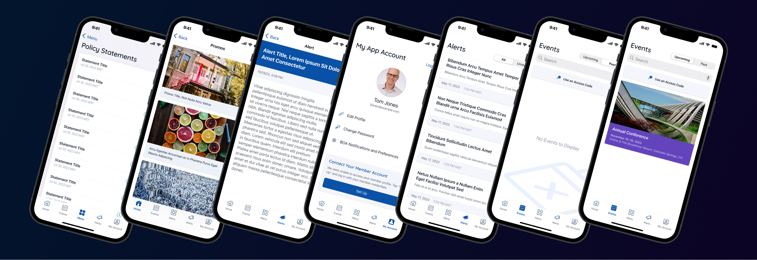
The remaining parts of the app — the Events, Alerts, and Account tabs, as well as any menu item's destination — would each need specialized attention. The design cycles on these screens would all go much faster, however, as less strategic rework was needed; they could be more simple visual refreshes, mostly maintaining the existing layout and architecture. There were changes, of course, but I tried to keep the structure similar overall, benefitting both the users that would have to process this redesign, as well as myself and the Android lead who would be implementing it.
I followed a good amount of the visual identity I developed for Conversations in this effort. I wanted to establish more organization-wide visual continuity, especially if a user would be switching back and forth between more than one app from us, or even checking out our website. For example, I kept the empty states similar to those I designed for Conversations, and I used splashes of the Quicksand typeface throughout, as it's used on our company-wide branding and marketing materials.
Implementation
My first challenge with this implementation was getting acquainted with this large and complex codebase without the benefit of the "why"s that are answered by documented code. Lacking an app development background or meaningful access to the maker of this thing, with only the CTO's faith in my ability to learn at my back, it was time to dig deep.
As a lifeline, I noticed that the previous developer loved design patterns — many major structural components of this app fit into one or several. Browsing articles on Hacking with Swift introduced me to how several patterns that were used extensively here, such as coordinators and state machines, were best adapted to iOS. Researching the best practices and applications of these general ideas did a great deal to help me understand why a file or class or component might exist and where it should fit into the bigger picture.
Other parts weren't so easy. The networking behavior, for example, was entirely custom due to the complex needs of our wide array of clients. Or take the way we handle user accounts, which is complex and unintuitive out of necessity: it needs to handle some odd cases like a user registering for an event, interacting with the app and the client organization, and only creating a real app account once they're at the event. That's just one of a good many account-adjacent states and flows a user might take.

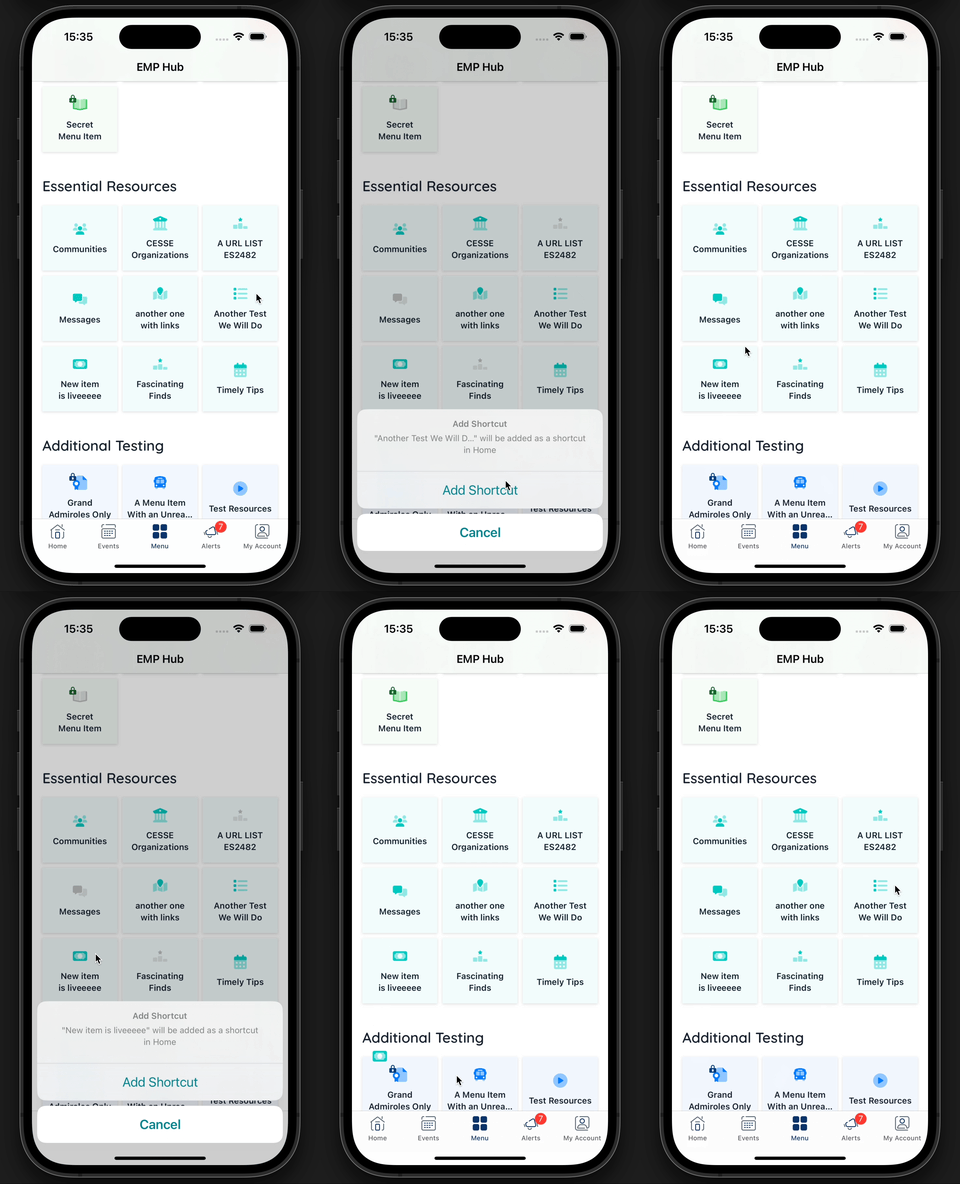
A highlight for me was handling interactions. I greatly enjoyed coding little micro-animations and using haptics to enhance certain gestures and functions. Compared to what I was used to on the web side, I enjoyed having access to deeper, more specialized tools and APIs that worked on every target device.
Wrap-Up
If given the choice, would I learn another new discipline this way, cannonballing straight into the deep end? I'm not sure. I certainly enjoyed the challenge and the chance to flex some design and programming muscles. Digging into a gigantic, undocumented codebase was intimidating, but also exciting. I feel as though this implementation took me longer than it should have because of the lack of handoff or guidance, and ideally this process would have been more development and less archaeology.
Regardless, after a rigorous internal design process, a challenging implementation, and some rounds of good QA later, my first major effort launched to hundreds of clients and their tens of thousands of users. We've been getting overwhelmingly positive feedback, and it's exciting to see my own work in the wild. I'm currently underway with the next big new feature, and I'm coming back with more experience and an eagerness to do even better.