The USA Cheeseboard Native App Design — Figma
All ProjectsA couple of years ago, before I moved into the full-time iOS developer role at RD, we were contracted by the US Dairy Export Council to build a recipe app from the ground up. The problem was, the mobile department had no design resources of their own; the intrepid lead iOS dev (whose position I would later move into) would simply make up UIs as he went during development of our primary product. Since we wanted a full, dedicated design cycle on this effort, and since I had shown the aptitude and enthusiasm, I was tapped to try my hand at this.
What followed was a month-long design process across many rounds of revisions and underlying specification changes. I had a good time doing it, and the design was successful enough that it, combined with my imminent CS degree and my willingness to learn new things, lead to me being on the CTO's radar when it came time to replace the retiring lead iOS developer. I now do that full-time today.
Cheese to Please
When I started designing, the set of features was not yet defined. While we were working out what those might be (some of which would come from my work) I had a few simple directives from the client:
- We want a recipe app
- It should have features specific to US cheese, whatever those might be
- It should generally conform to this branding guide we have

Cheese-specific features was a tricky one. I'm certain there are generic recipe apps that one could license and customize with much less effort than contracting a dedicated app, so what could we account for that a generic app couldn't?
Cheeses as first-class content was a consideration from the start. Anyone can write "mozzarella" on their ingredients list, but USDEC was uniquely positioned here: not only do they have a lot of knowledge about each cheese on offer, but they can also serve as a bridge between consumers and producers, furthering their mission to promote growth for US cheesemakers. Making the cheeses just as important as the recipes, using them as a nexus to discover other recipes and content, just made sense.

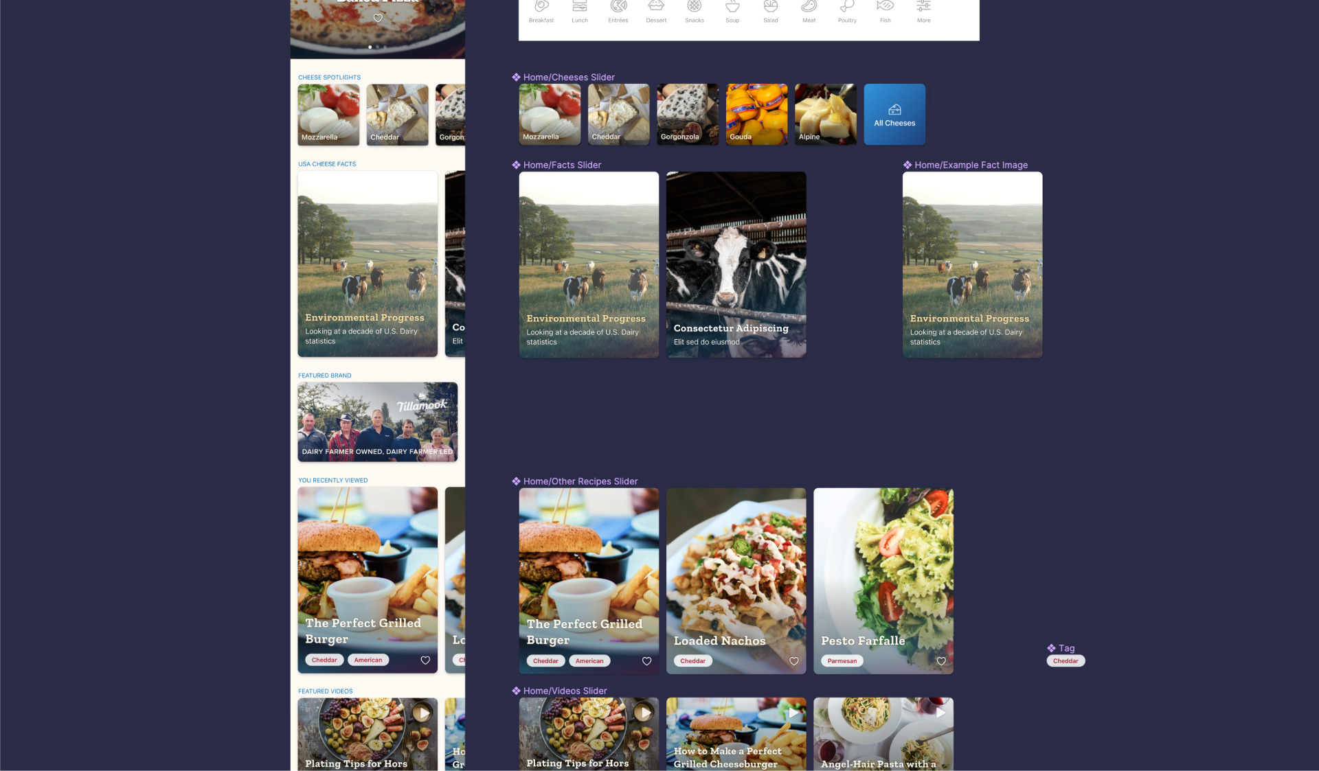
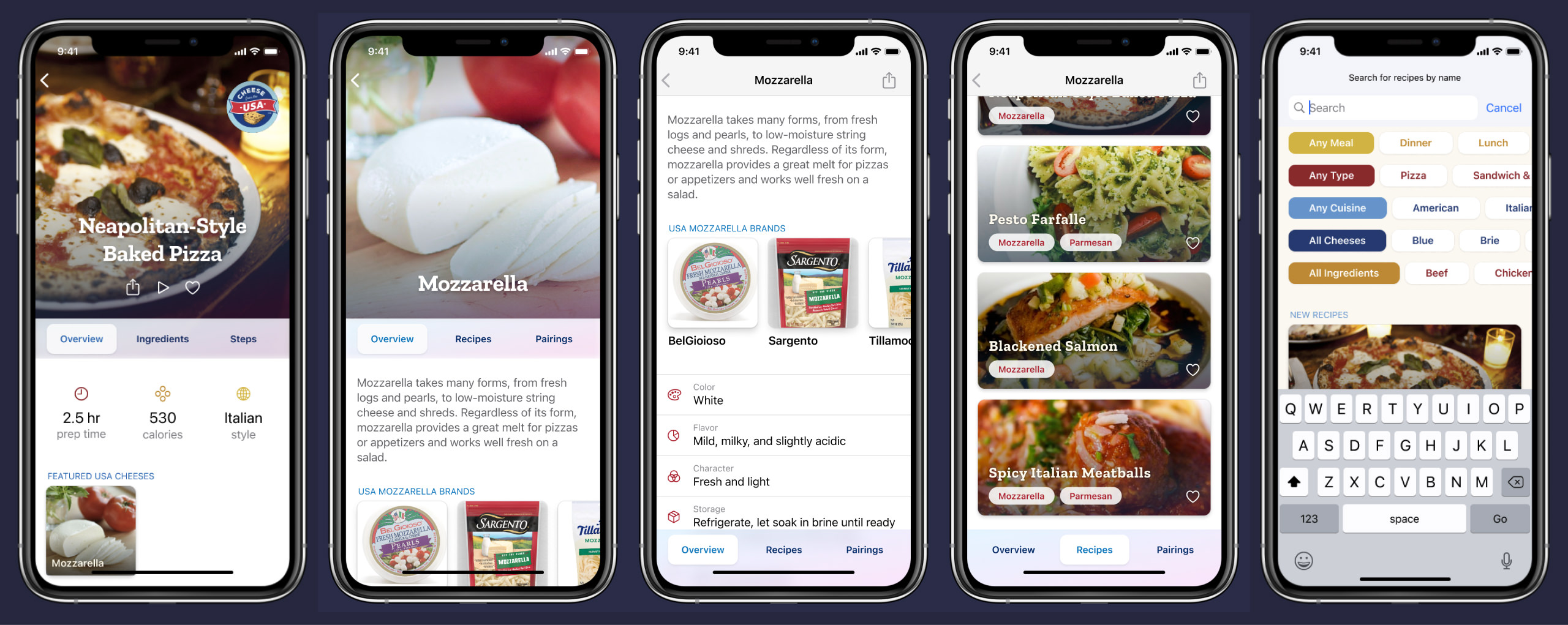
I ended up proposing a few features to this effect. Since USDEC had extensive data sheets for each type of cheese they catalogued, we could have a full-featured landing for each one, including common attributes, featured recipes, and US brands. Cheese types would be just as important as other recipe attributes like cuisine category or meal type, and users could use this as a search parameter. Cheeses could be tagged on recipe cards on lists and favorites and search results. Not only could we promote USDEC's mission, we could do so via genuinely helpful and user-friendly features.
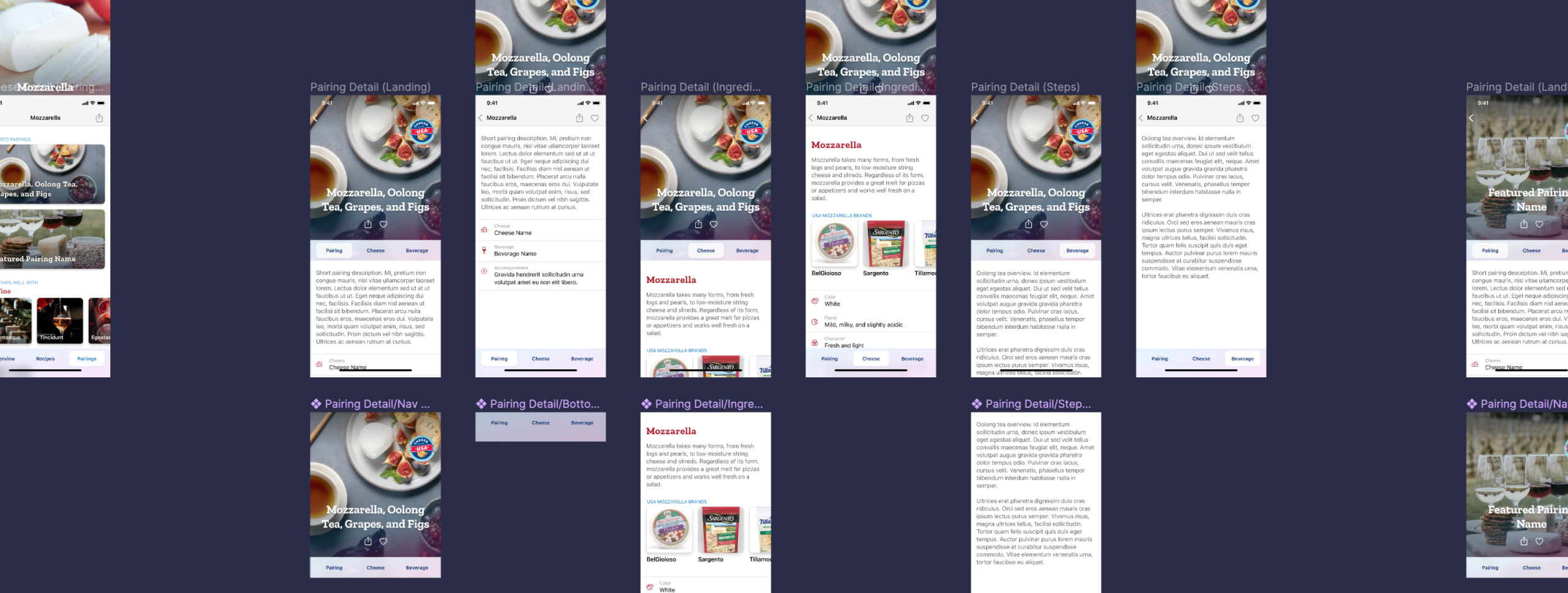
Another aspect that came up in conversations was the idea of pairings, and USDEC was enthusiastic about writing content in this area. Not only were they a sort of recipe unto themselves, but they were another hinge around which users could rotate in order to discover further cheeses, ingredients, and content.

Throughout the process, staying focused on features that were genuinely helpful to users was my overarching goal, and I believe it made the final product better. It was interesting to interface with the dev, learning the capabilities and limitations of the platform and using that to inform my work.
Prototypes As Specification

I've noticed that client stakeholders are almost always visual learners. No matter how brilliant and evocative a design document or a specification writeup or even a static design comp might be, there's nothing quite like putting a working prototype in their hands and letting them play with it. So many small things go into how an interface "feels" to use that it's next to impossible to describe it all with specifications alone, let alone have it resonate with decision-makers. Enter: Figma.
The design process for this project was somewhat an experiment, nebulous and shifting, not mapped out from the start. The mobile department's modus operandi has traditionally been to build and maintain RD Mobile's products, an ongoing process that sees incremental changes to a single product over years. This kind of singular effort with a defined conclusion was rare. To that end, a lot of the responsibility for defining requirements, interactions, desired network behavior, and other features fell not on any kind of specification document or canonized writeup, but on the design.
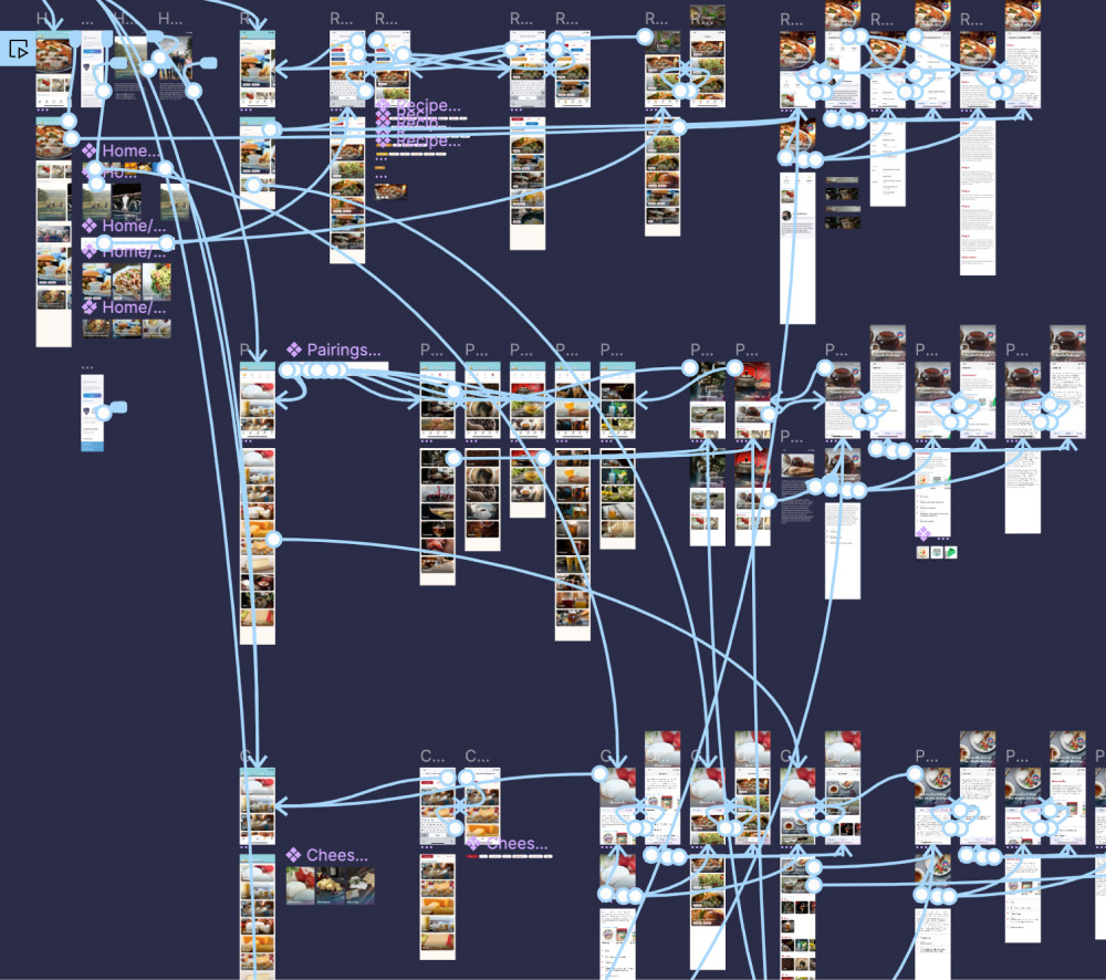
Figma's prototyping capabilities proved to be this project's backbone. While my current-day projects in the mobile department have more formalized specification — UI flowcharts, formalized requirements documents, commented visual comps — the prototypes did a lot of heavy lifting here. What should the navigation stack for this section look like? Well, go see what the prototype does. Interactions within a screen? Prototype. Typography? Element sizing? Once again, see the prototype.
While in hindsight I wouldn't recommend that way of doing things very often, it worked out pretty well for this effort. We might have gotten lucky with an enthusiastic and flexible client. Given the open lines of communication within the company and the rapport I had developed with them, it was easy enough to gather for an impromptu meeting whenever there was ambiguity or undefined behavior.

Once everyone was happy, my last role in this process was to support the developers as they built the app. This meant not only creating asset factories, documenting measurements, and providing other design specification when needed, but also being on call to make decisions about new behavior, ambiguities, or details that the prototypes were not high-resolution enough to cover.
The process was overall quite eye-opening. I enjoyed learning about and designing around the restrictions, motifs, and idioms of a new platform, and I believe the design was successful. All parties were happy with it, and I'm proud of the product we made.
