Auto Care Association Website Design and Implementation — Figma, Sass, JS, Progress Sitefinity
All ProjectsThe Auto Care Association is a large member-based organization focused on providing vehicle specialists with the information and resources they need. Their umbrella covers everything from mechanics to parts manufacturers to educators to government regulators, which means they have a large audience to serve and a lot of content to organize.
This project is a good representation of my work with RD's frontend team. The project included a website redesign, a rebuild in a new CMS, a new content strategy, and an overall rebranding. Within our company, it was handled by a team of three.
Design
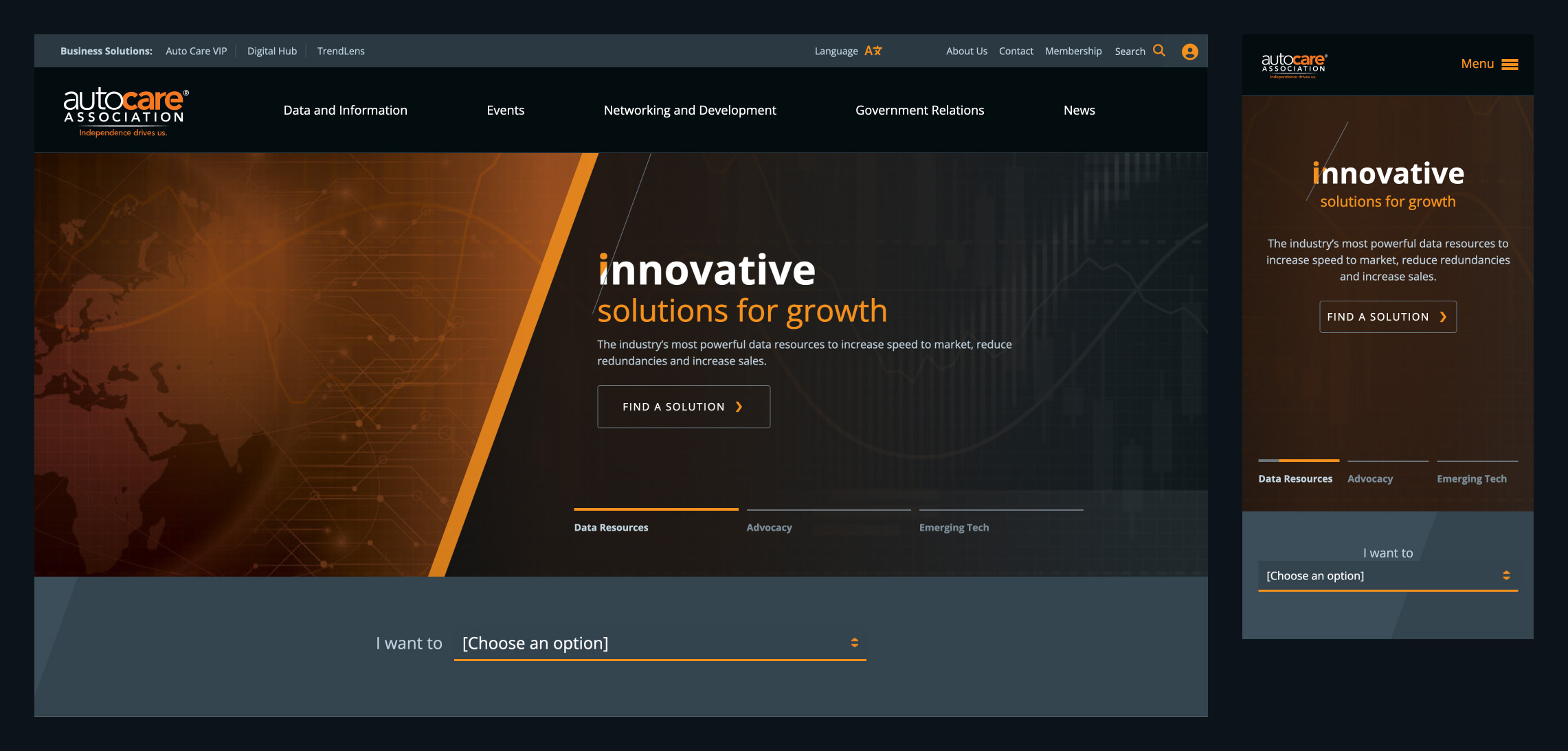
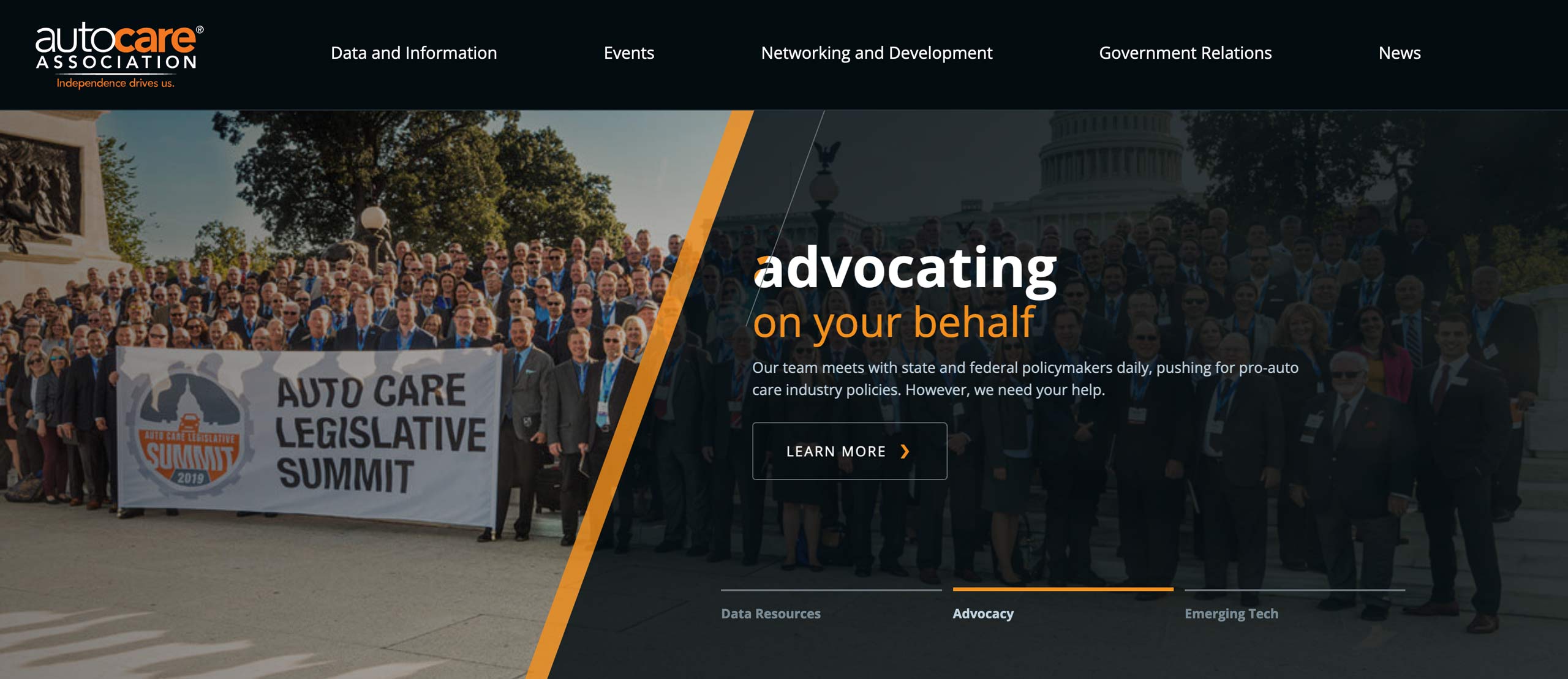
As with the AIAA project, this was a client willing to try new things and establish a forward-thinking visual identity. They expressed a desire to feel technical and cutting-edge, which is a contrast to usual member-driven association asks. In my initial design, this manifested as striking angled lines, confident typography, and a tendency to clip shape boundaries — not something our usual clientele would jump for joy at.

The company's typical design process sees three of the company's designers (oftentimes, that's all of the company's designers) interpret the client's needs and wants independently, each creating their own homepage comp with its own features and visual direction. We each present our proposal in a reveal meeting with the client, and then the client decides on elements of each they like and dislike. From there, the lead designer on the project synthesizes all of this into a unified design proposal. This project was pleasant because I was the design lead and the client chose my proposals wholesale, with minimal tweaks, leading to a very quick turnaround for subsequent rounds.
Implementation
Construction of the static build was made easier using an early version of my frontend build automator, though due to the unusual freedom of the design process, I needed to do a lot of additional work on the visuals. I had a good time implementing the homepage feature, though my initial effort's animations were a bit too bold, and I had to back them off a bit; for example, my plan was to use the fresh (at the time) CSS layer blending modes to animate the feature's angled, clipping features, but it was decided that a simpler line motif should be used instead due to visual distraction.

Despite the more-interesting-than-usual visuals, this was a fairly standard CMS implementation. My usual practice is to place a large emphasis on the client's editing and management experience, making sure pages are easy to build and content is easy to author, including many customizations of Sitefinity's page builder and in-CMS documentation of content types and fields.
Another requirement here was a language-switching function. Since a large portion of their members are Spanish speakers, we needed to maintain parity between two translated versions of the site. I was able to get up to speed quickly with Sitefinity's translation manager and use it during the build.
A few training sessions between me and client stakeholders capped off this effort, leaving all parties pleased with the work and ready to bring the new site live. They were a great association to work with, and I appreciated their willingness to try new things, reminding me why I fell in love with design. And after the site had been live for a few months, they praised the increased user satisfaction, reduced load times, and decreased number of clicks required to get users to relevant content.
