RD App Support Website Design and Implementation — Figma, Sass, JS, Progress Sitefinity
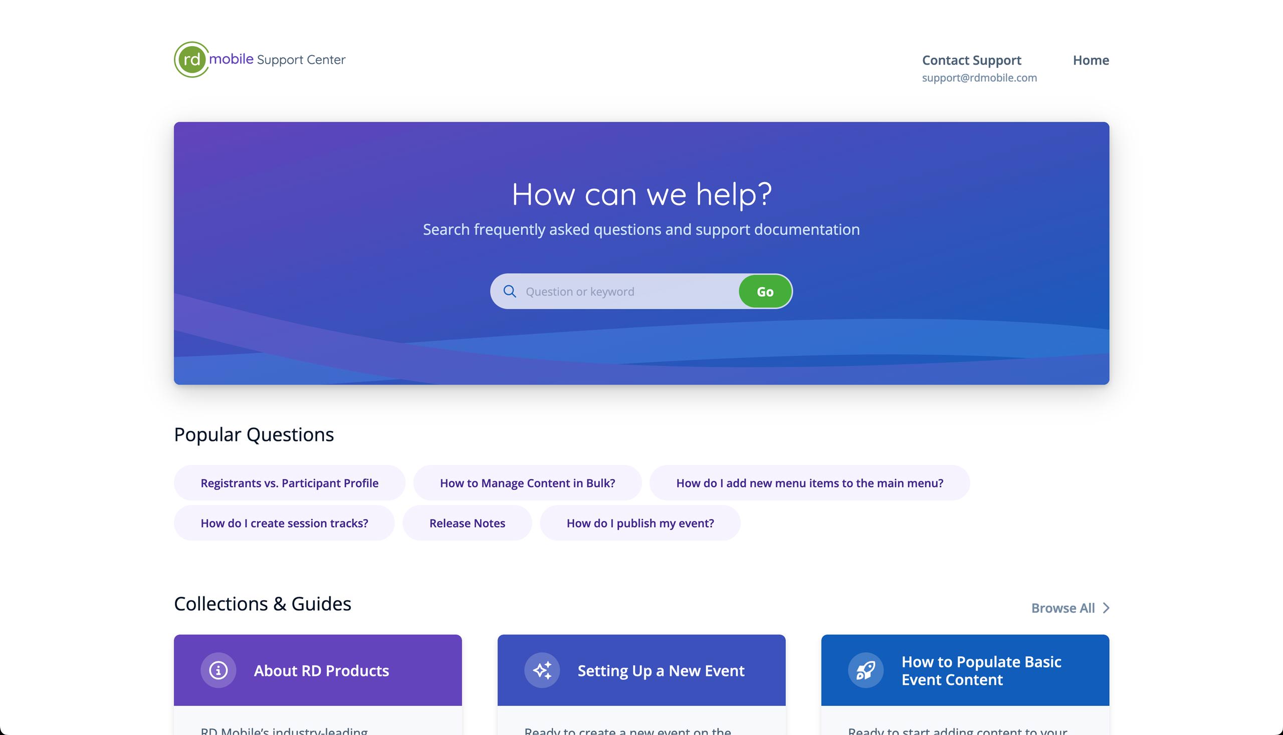
All ProjectsThis focused little project is a good example of a quick, effective redesign process. RD's support portal for its mobile products was clunky to use from both ends: the frontend hadn't been updated in a while and looked dated, and the backend was a pain to work with. The former made our company look old-fashioned and hard to work with, and the latter lead to the support team falling behind on keeping help content up to date. This effort aimed to reduce overall pain on both sides while conveying the company's values via design.
Design
Because of the short timeline, I was able to get more or less carte blanche to make decisions during the effort. This was an internal matter and so didn't require the waterfall-esque design revision and approval process that we use for clients; I was able to mock things up as needed, swapping back and forth between my designer and builder hats as needed, often multiple times in a single day. For ideas that deviated further from what was there, I had a direct line to the CTO and CEO to quickly bounce proposals off of.
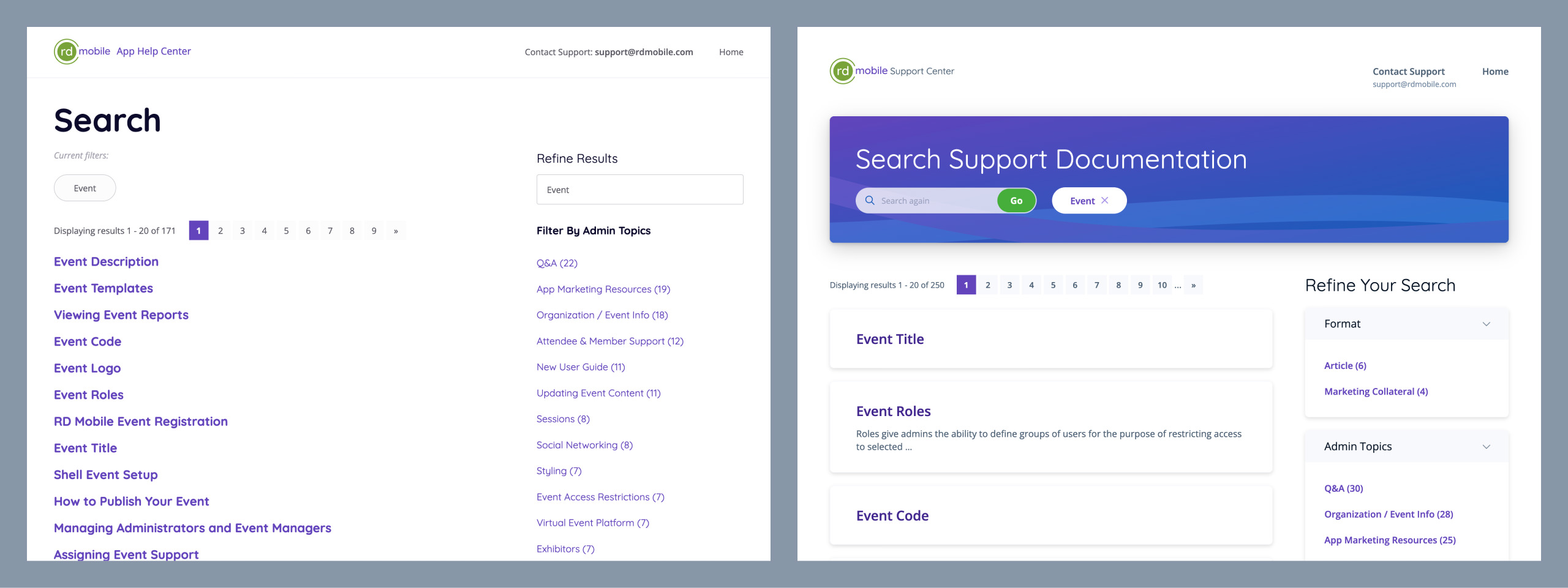
Overall, my self-imposed directive was to use design to increase the usability of the product, not only the visual attractiveness. This manifested in both small ways — more effectively drawing the eye to what's important, for example, or using a consistent visual language when representing various entities and objects — and larger ones, such as more drastic content restructures or an overhaul of the search functionality.
One of the largest problems I could see while auditing the existing site was that our content all seemed quite disconnected. Some items might have been thematically linked to others, and while one could obviously add links to other articles in body content, this had only ever been done sporadically, relying on the content author going the extra mile to trawl the site for relevant items. Someone had attempted to build an automated "related content" component that tried its best to glean relationships based on keywords and body content, but results were inconsistent at best and downright irrelevant at worst. Therefore, I proposed another structural layer to the site's content: collections.
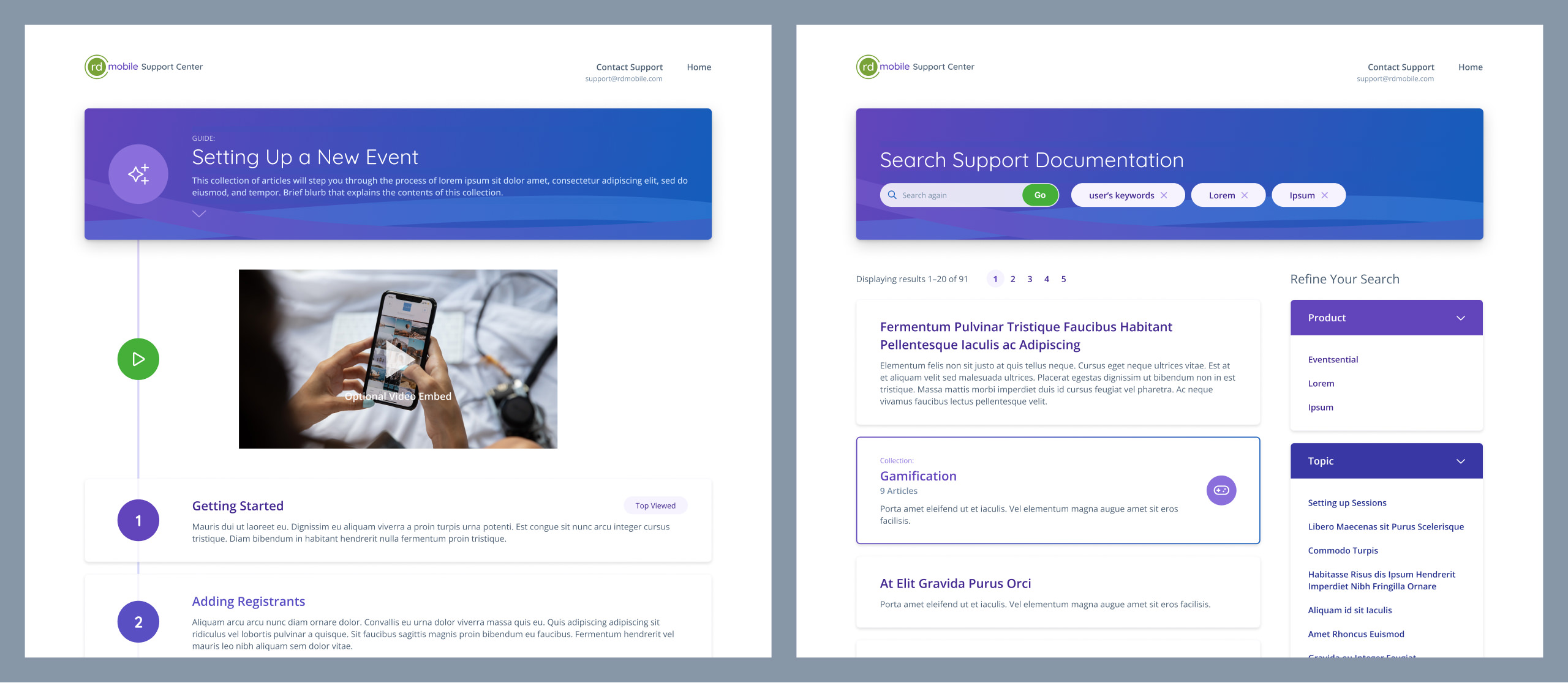
We needed a way to manually and intentionally group our help articles. By creating a collection, an author can create a curated, guided experience for users, ensuring that all relevant articles are within easy reach. Collections can include introductory content as well as a video, tying the grouping together with text describing the umbrella concept or feature. Checking the box in the CMS to present the collection as a "guide" would cause the presentation to imply a step-by-step ordering to the articles, as though they were an ordered checklist to be followed (in essence, our authors could choose whether it's a ul or an ol).
The feature proposal was well received by leadership and the support team, who were also eager to solve the problem now that it had been pointed out. Combined with a revamped search page, a clearer and more useful article detail experience, and a homepage with more inroads to relevant content, I got almost entirely positive feedback. Which is good, because the timeline was too tight to throw things away and start again.
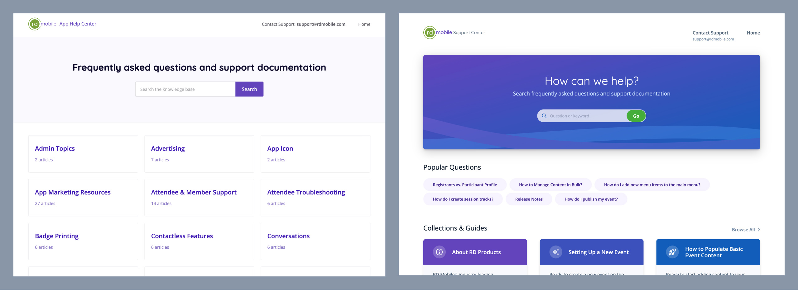
A positive (and surprising) byproduct of the redesign was the way it invigorated the support team: having a support portal that looked good and that we could be proud to show off had a profound effect on their motivation to audit existing articles, write new content to fill in the gaps, and do a major reorganization to account for the new collections feature.
Implementation
Threading between design and implementation was somewhat chaotic, but in an enjoyable way. I began building soon after establishing a visual language, switching back and forth as needed: when I ran into a screen that I wasn't sure how to best display, I went back to Figma and toyed around before returning to my code editor. I was also able to sneak in design time while waiting for support staff to make tweaks to content for export/import.
Both the old and new support sites were built on top of Progress Sitefinity, making the content migration, such as it was, quite easy. I did have to do a good amount of manual work to bring things up to the standard I wanted them at, but due to the relatively low volume of items, this was preferable to writing automation in this instance.
Covering the implementation myself also meant that I knew my technical abilities and experience in Sitefinity well enough to design features that I otherwise would have been hesitant to bring forward. Having a clear mental model of how these things would be implemented brought commensurate clarity to the design process; for example, knowing how the collections would work allowed me to devise presentations that would maximize their usefulness as a feature.
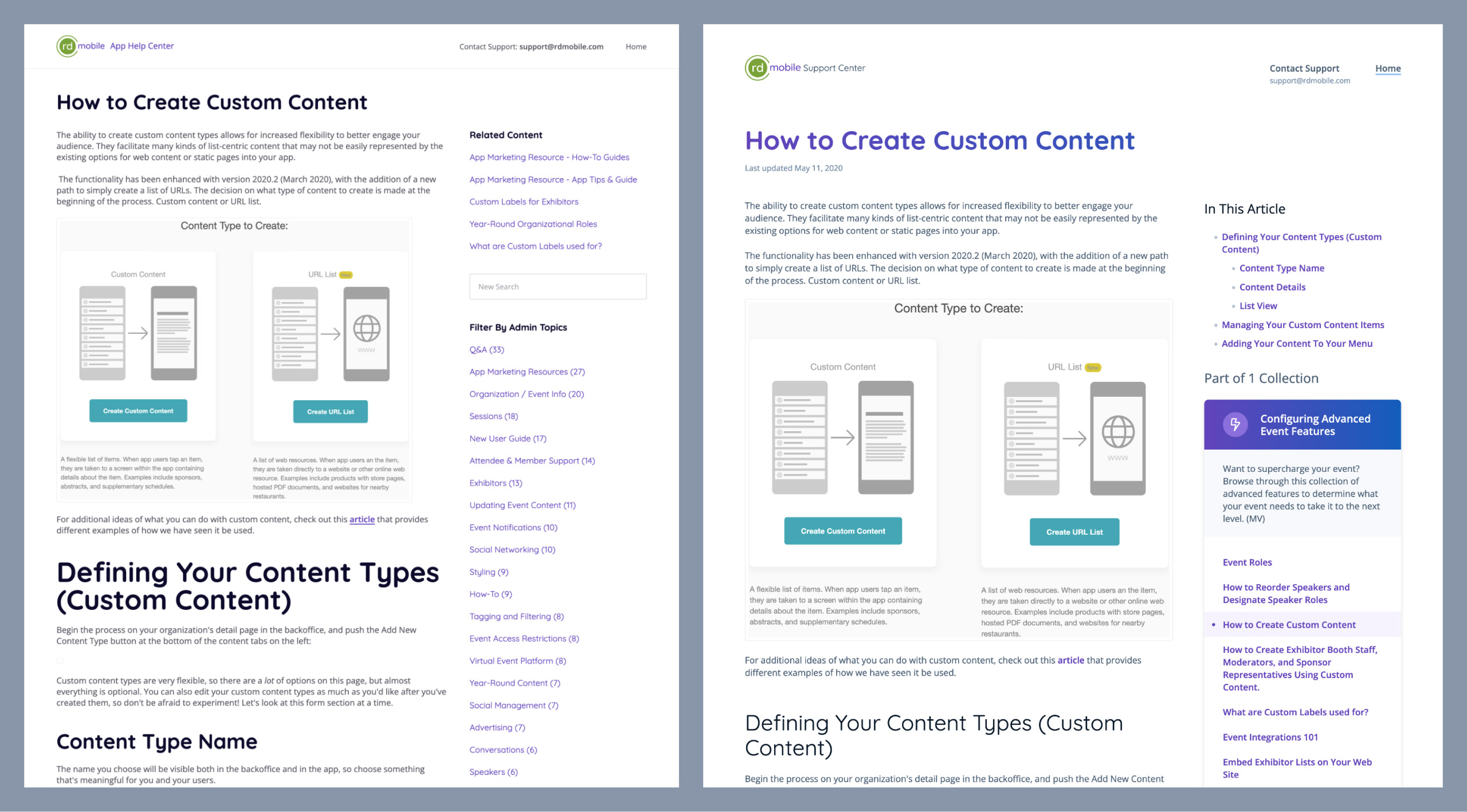
Once done, this effort was received extremely well by both internal staff and external client users. Clients praised the look-and-feel updates and the collections feature in particular, as they felt more confident and "grounded" when looking for help. Internal staff loved the updates to the authoring experience, and many made admirable efforts to organize and audit existing articles. From my side, it was a fun, albeit chaotic, little redesign effort that I think did a lot of good for our company.
