Ceramic Arts Network Website Design and Implementation Sass, Vanilla JS, Progress Sitefinity

All Projects

My company was contracted by the American Ceramics Society to overhaul their entire suite of online properties under the Ceramic Arts Network umbrella, including publications like Ceramics Monthly and Pottery Making Illustrated, subscription services like Ceramic Recipes, and learning resources like CLAYflicks.

The network of sites should be interlinked and interconnected, sharing a single sign-on service their members would use to access all CAN content. Managing individual subscriptions and services via that account should be seamless. On the client side, authoring and publishing new content should be easy and straightforward, especially for staff whose work spans multiple properties; at the same time, the backend permissions should be granular enough and easy enough to manage such that senior CAN staff can effectively apply a recommended least-privilege policy.

Design

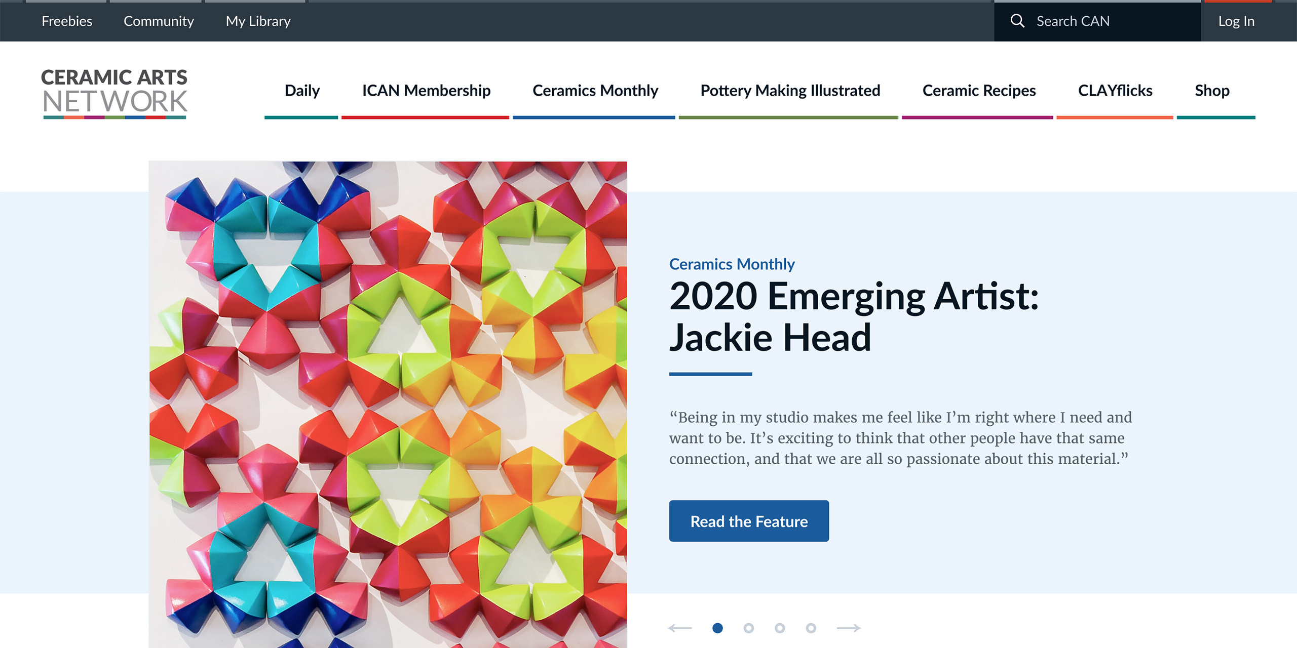
The Ceramic Arts Network hub site, as well as each of its six sub-sites and a shop, came with a logo and established branding package that had been in use since each property's creation. The branding guidelines themselves did not contain many visual motifs or guidelines, and while we had some freedom to interpret those gaps, the client wished to keep unique visual flair to a minimum. My challenge, then, was to create an attractive web hub using minimalist design sensibilities, where each sub-property was similar in look and feel but able to be distinguished enough from the others such that navigating between them did not confuse.

Each sub-property had a primary color attached, reflected in the logo of the umbrella property as a multicolored striped line — an obvious design hook to use to our advantage. My first take on the homepage utilized this motif by utilizing this color pattern throughout in order to represent the diversity of the sub-brands.
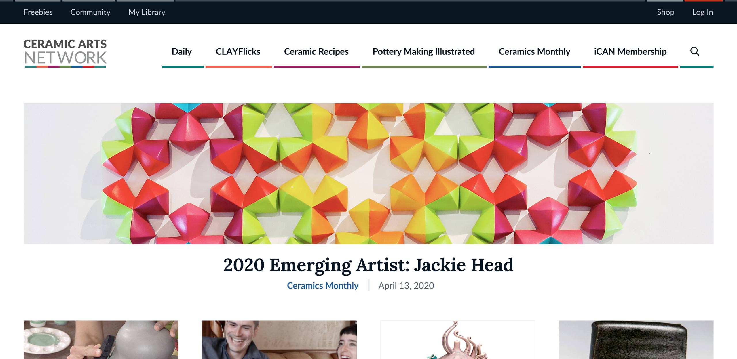
A crop of the first version of my homepage design comp, showing a thin header whose navigation integrates their logo's striped line motif

Gleaning what I could from the CAN logo, the design provided visual continuity from that asset via its use of horizontally-oriented structures and layout, minimal line motifs, and grouped presentations of sub-brands to provide a sense of organizational unity. I had to strike a careful balance with what to present, as they had so much content they wished to show off at any given time that it could easily overwhelm a viewer.
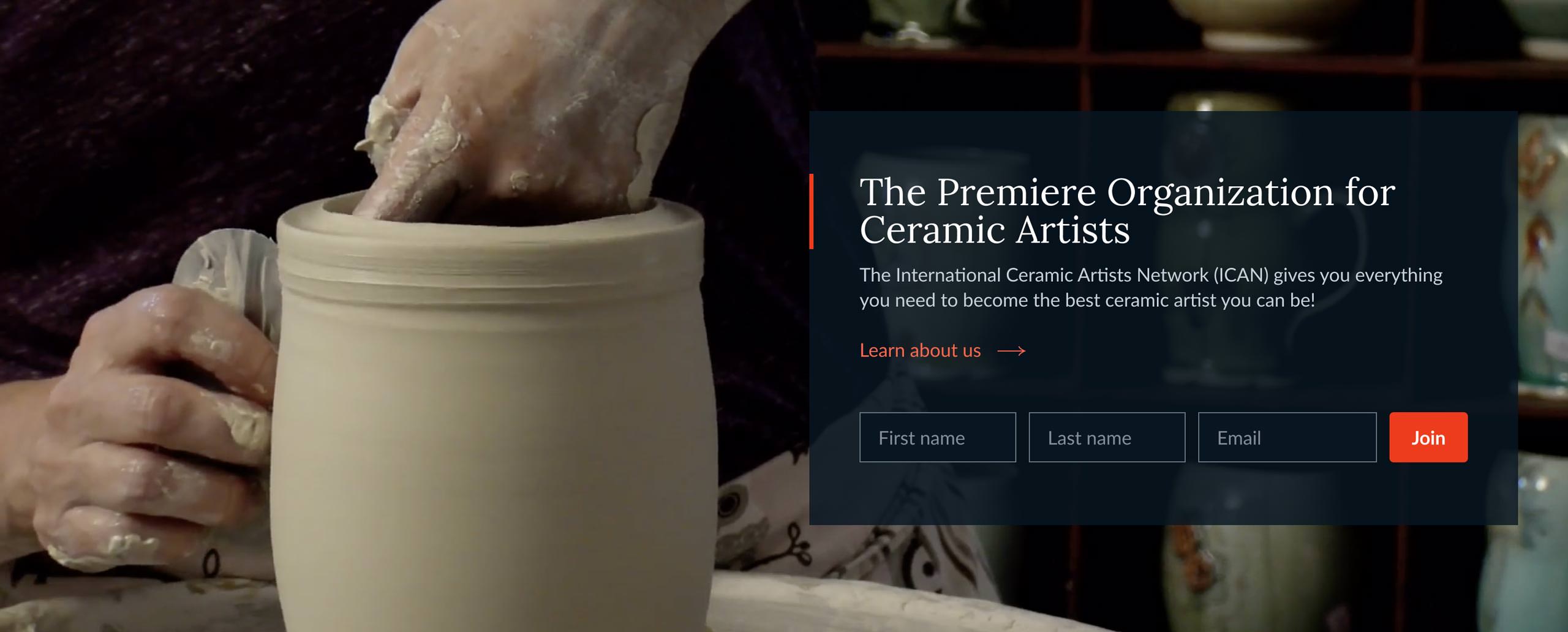
A crop of the first version of my homepage design comp, showing a full-width horizontal promo area for their mailing list
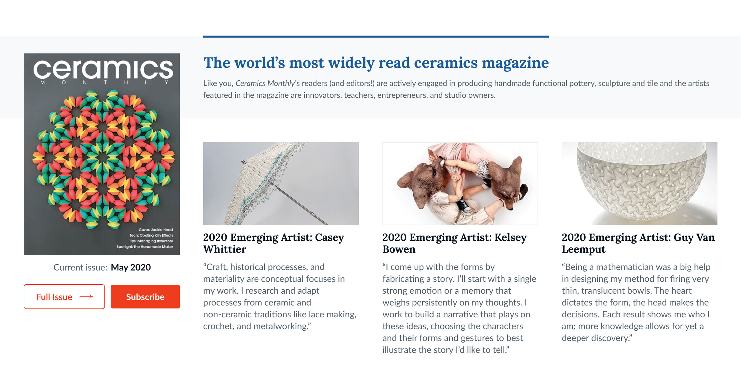
A crop of the first version of my homepage design comp, showing a feature area for the latest Ceramics Monthly issue
A crop of the first version of my homepage design comp, showing a group of sub-brand links

This first iteration was met with quite a bit of positivity from client stakeholders, and of the three visual directions we presented them, they decided to go forward with this one. The rest of the process was somewhat protracted — many stakeholders had particular design sensibilities, some of them conflicting. I was able to navigate this by providing recommendations and data about good design practice, chiming in with my experience when guidance was needed, taking a back seat when it wasn't. Eventually we emerged with an agreed-upon design that all stakeholders were happy with.

Implementation
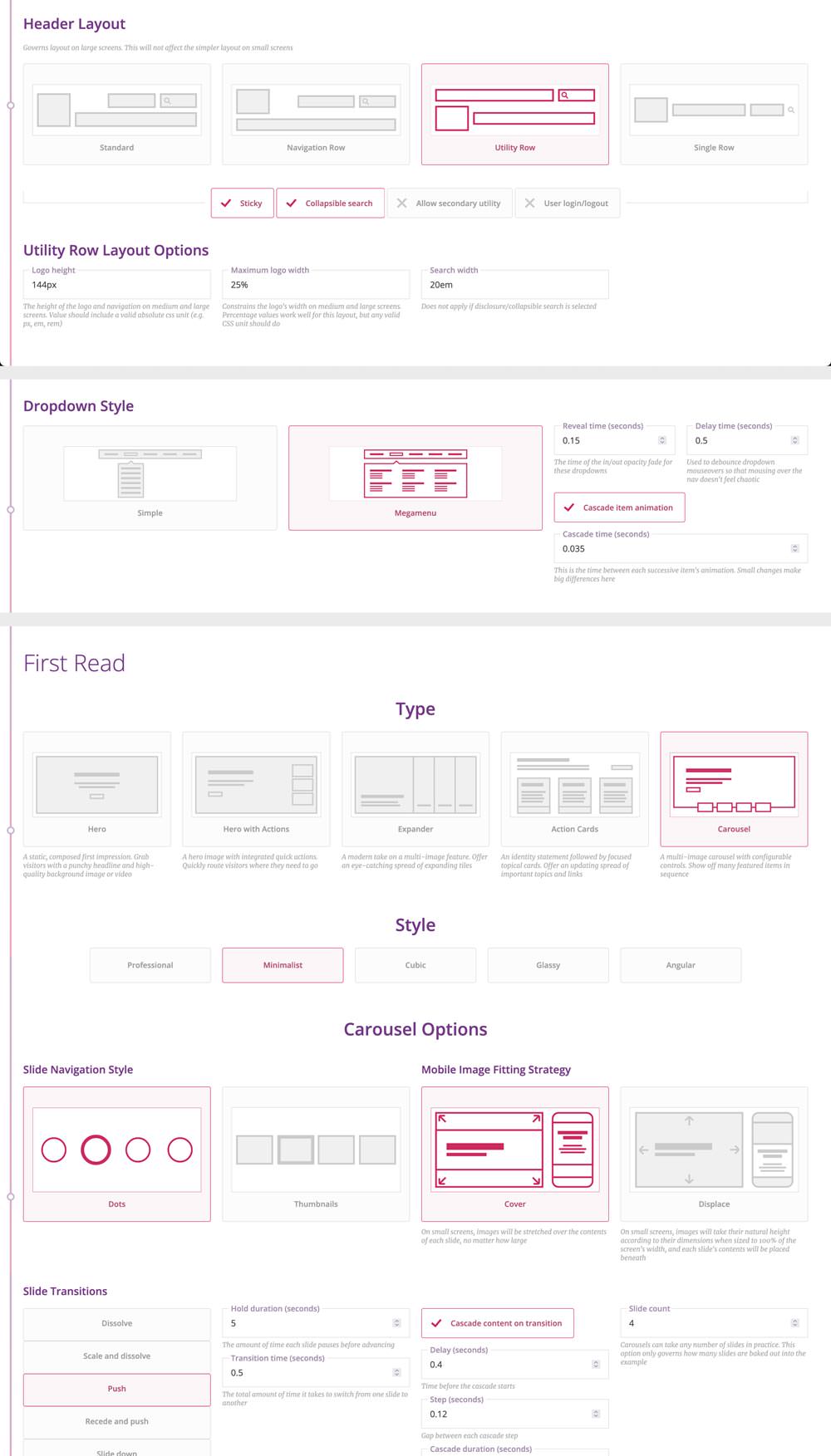
A compilation of screenshots of my frontend build automator, showing the configuration of some of this project's frontend features

This project was one of the first production uses of my frontend build automator: I was able to start the static build phase of this project with custom boilerplate code that included many elements and components found in the final design, saving 50% or more of the time spent on this deliverable. Elements such as the header and navigation, full-width parallax interstitials, calls to action, and feature slideshow were already included, with defined behavior throughout the entire responsive range, requiring only minimal visual tweaks to be production-ready in accordance with the approved designs.

From there, I focused on making sure the site frontend was lightweight, easy to maintain, and felt good to use. Despite time and client budget constraints, I was able to give it a pass for animation and micro-interactions.

We settled upon Progress Sitefinity for the core of the backend management because their multisite capabilities closely aligned with the need to power a network of sites. The developers assigned to the project worked on the custom single sign-on integration while I worked on adapting the frontend to CMS templates, pages, and dynamic feeds.

I created several custom components within Sitefinity's page builder system, allowing for a more flexible and pleasant content authoring experience. These components automatically adapted to the property in which they were being displayed, streamlining the client's authoring experience, with the option to override this behavior and match the look and feel of any other property in the rare case of a cross-site promotion or mention.

Lastly, I provided the client with hands-on training on the use of their new CMS and site across several sessions. CAN appreciated the relative ease of the authoring experience and the flexibility of the options provided to them. I spent a lot of time tweaking Sitefinity's page builder in order to provide a more what-you-see-is-what-you-get experience, which is a touch they particularly appreciated after their previous CMS experiences.

Of course, no matter how well-calibrated the guardrails, client-authored content can have a way of going against design guidelines, so we kept close watch on the site in the following weeks in order to offer suggestions and tips for maintaining the look and feel of the site. But we pleasantly found they took to the new system quite well and were using our components and style guide.